Seeing the Big Picture: Redesigning Portfolio Health
Redesigning the account experience to help everyday investors understand their portfolio—and why it matters.
2024 / Athena Advisory


Introduction
As the Lead Designer, I led the design of Athena’s account experience leading to a 39% uptick in our core business goal of managed account adoption.
Timeline: September - October 2024
Team: Lead Engineer, CEO, Data Scientist, Customer Stakeholder
Contributions:
As interim PM—defined the MVP scope and prioritized features alongside stakeholders. Detailed blog on PM process here.
Designed the end-to-end account experience: architecture, flows, and UI
Delivered iterative prototypes and validated through feedback and usability testing
Collaborated closely with engineering, data, and client partners to align on feasibility and execution
Impact: $12M increase in AUM within 3 months of rollout


Background
Athena is an AI-powered financial advisor. We partner with retirement and wealth management firms to serve customers who don’t qualify for traditional advisors.
This case study focuses on redesigning the portfolio management experience, a core feature that helps users track, assess, and improve their investments.
The Problem
There were three problems with the legacy experience.
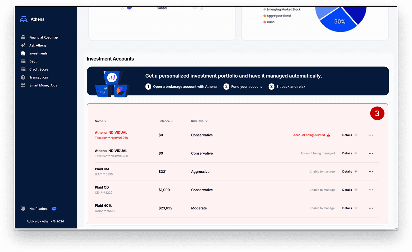
old experience
1. No clear sense of portfolio health
Existing account pages were raw and data-heavy, offering no clear sense of portfolio health or where to focus.
2. No actionable guidance
Users understand what steps to take next — leaving them confused and disengaged.
3. Buried business value
Benefits of switching to a managed account (our primary business goal) were hidden and difficult for users to evaluate.
The Solution
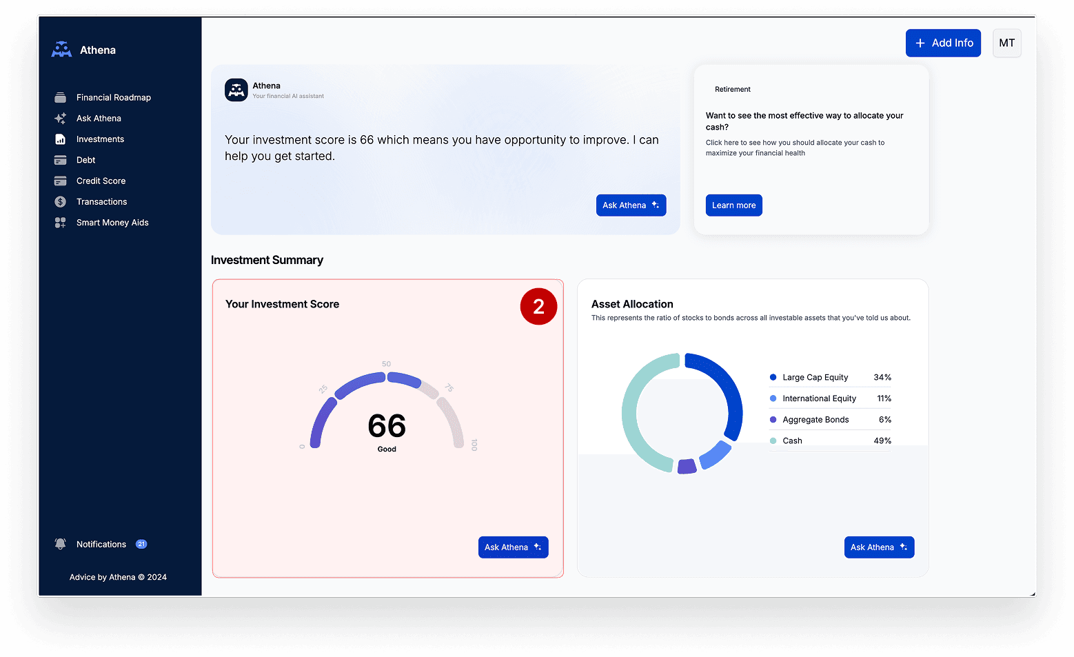
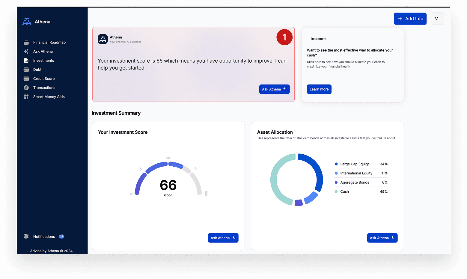
The final solution helped users quickly understand their scores, see what needed attention, and take meaningful steps to improve.
Your portfolio, decoded.
Know what you’re missing—and what you could gain.
Clear, side-by-side comparisons show how your portfolio stacks up to a professionally managed one
Quickly see where your portfolio stands.
Scorecards for key metrics making it easy to identify strengths and surface areas for improvement
Clarity behind every score.
Personalized recommendations show you what’s working, what’s not, and what to do next.
Impact
$12M
AUM (assets under management) growth within 3 months of launch
39%
more users switched to Managed Plan after using portfolio comparison
Case study starts
01
Constraints
The redesign had to balance user needs, business goals, and technical realities within three key constraints.
No mobile support
Swap encyclopedic tables for focused charts and scorecards that surface the signal, not the noise.
Short timeline
Break the dashboard into standalone cards so users can instantly find what they need and explore deeper on demand.
B2B2C complexity
Pair every metric with plain-language explanations and tooltips, reducing ambiguity and reinforcing data credibility.
02
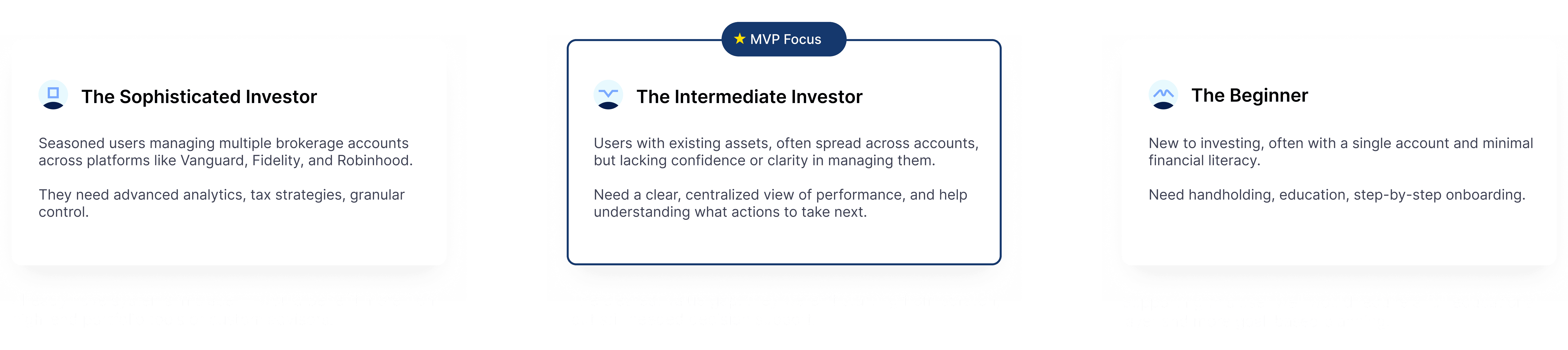
Users
Since users came through our wealth and retirement firm partners, we were designing for a broad base. We prioritized intermediate investors—our highest-impact segment—over designing a generic, one-size-fits-all experience.
03
Process
I started with notes, journey maps, and quick sketches to frame the problem. I moved early ideas into interactive prototypes as soon as possible to validate flows, share concepts with stakeholders, and refine the navigation and information architecture through feedback.
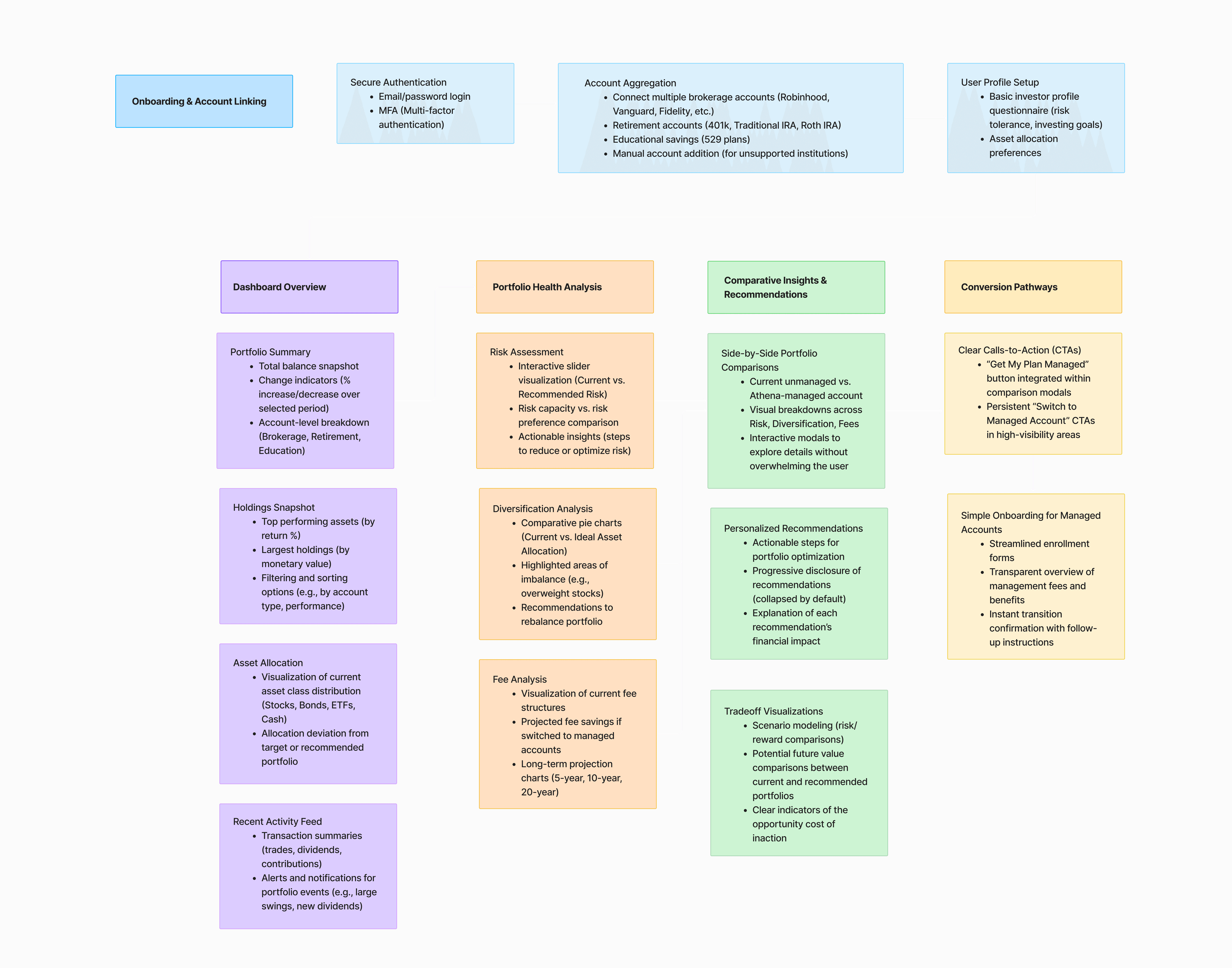
Experience architecture—I mapped out a high-level experience architecture that connects onboarding, account insights, and conversion flows.
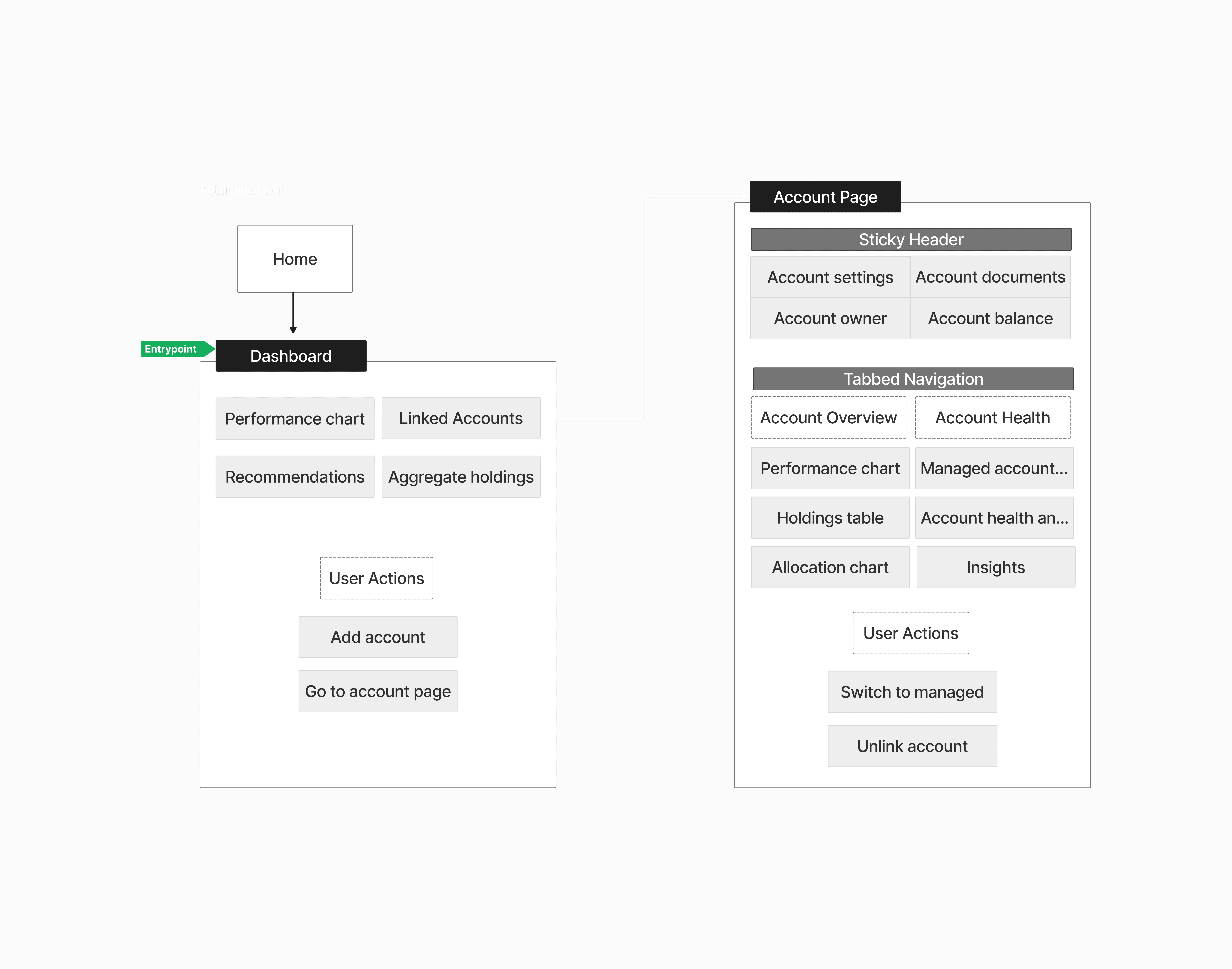
Information Architecture—I mapped the core navigation and content structure and captured the primary user pathways.

Fidelity Stages—I jumped into mid‑fidelity mockups within days so we could test before committing to pixel‑perfect polish.
Deep dives on high impact decisions
Challenge 1
Designing for Clarity
Problem
Many users felt overwhelmed by raw data with no clear signal of what was good, bad, or actionable. The experience failed to summarize portfolio health in a way that felt trustworthy and easy to understand.
Research Insight
“I can see my account balances, but I don’t know if my portfolio is actually healthy—or what I should focus on improving.”
How Might We
How might we help users quickly understand if their portfolio is on track?
Iterations
I started with the idea of a score to have something simple and scannable. How we represented it would make or break the experience.
1. Composite Score
A single, combined score summarizing portfolio health.
❌ Too abstract—users didn’t know what it meant or what to fix

2. Grouped Metrics in One Card
Split into three categories but kept together in one dense card.
❌ Hard to scan, difficult to compare, and lacked context.

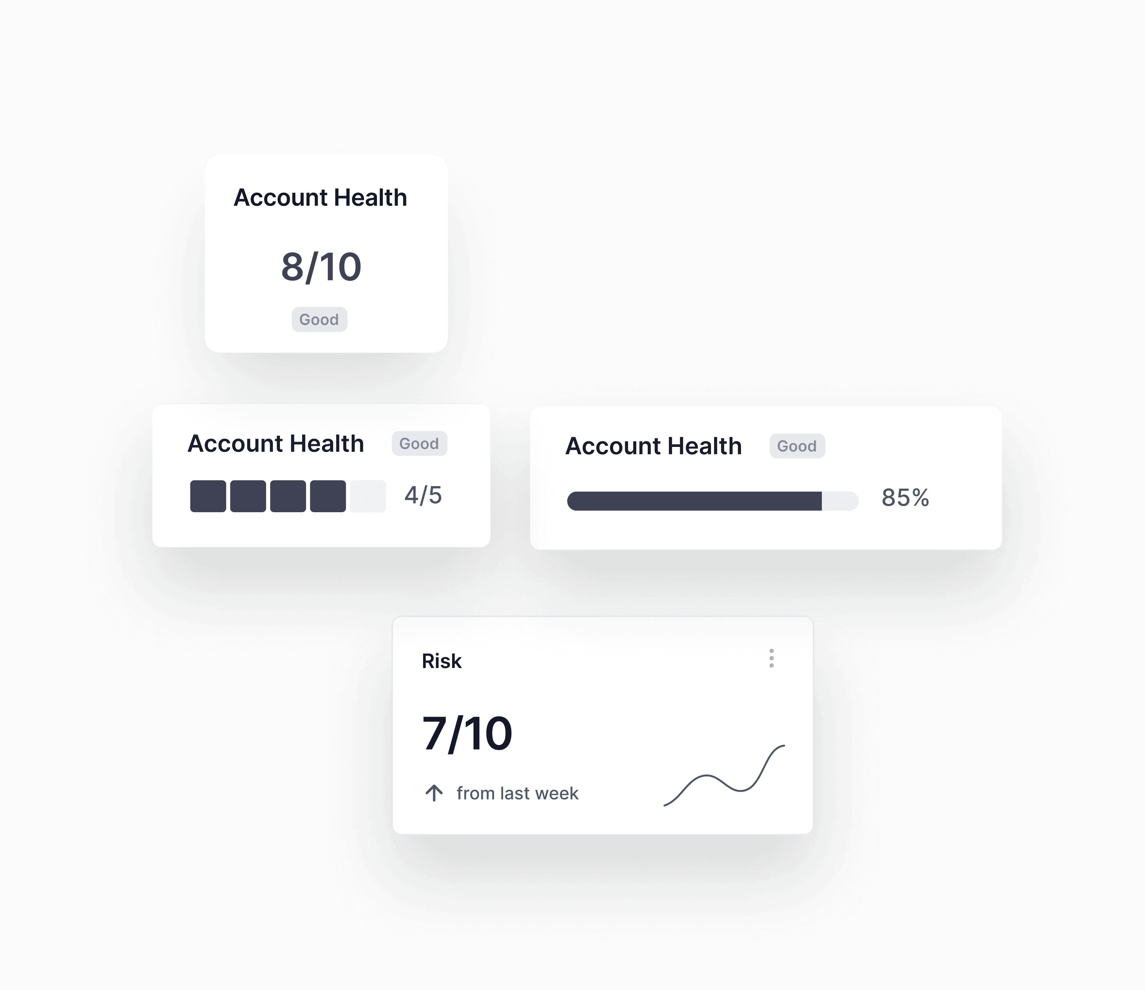
3. Modular Scorecards
Each metric displayed as its own dedicated, tappable card.
☑️ Easy to compare across accounts
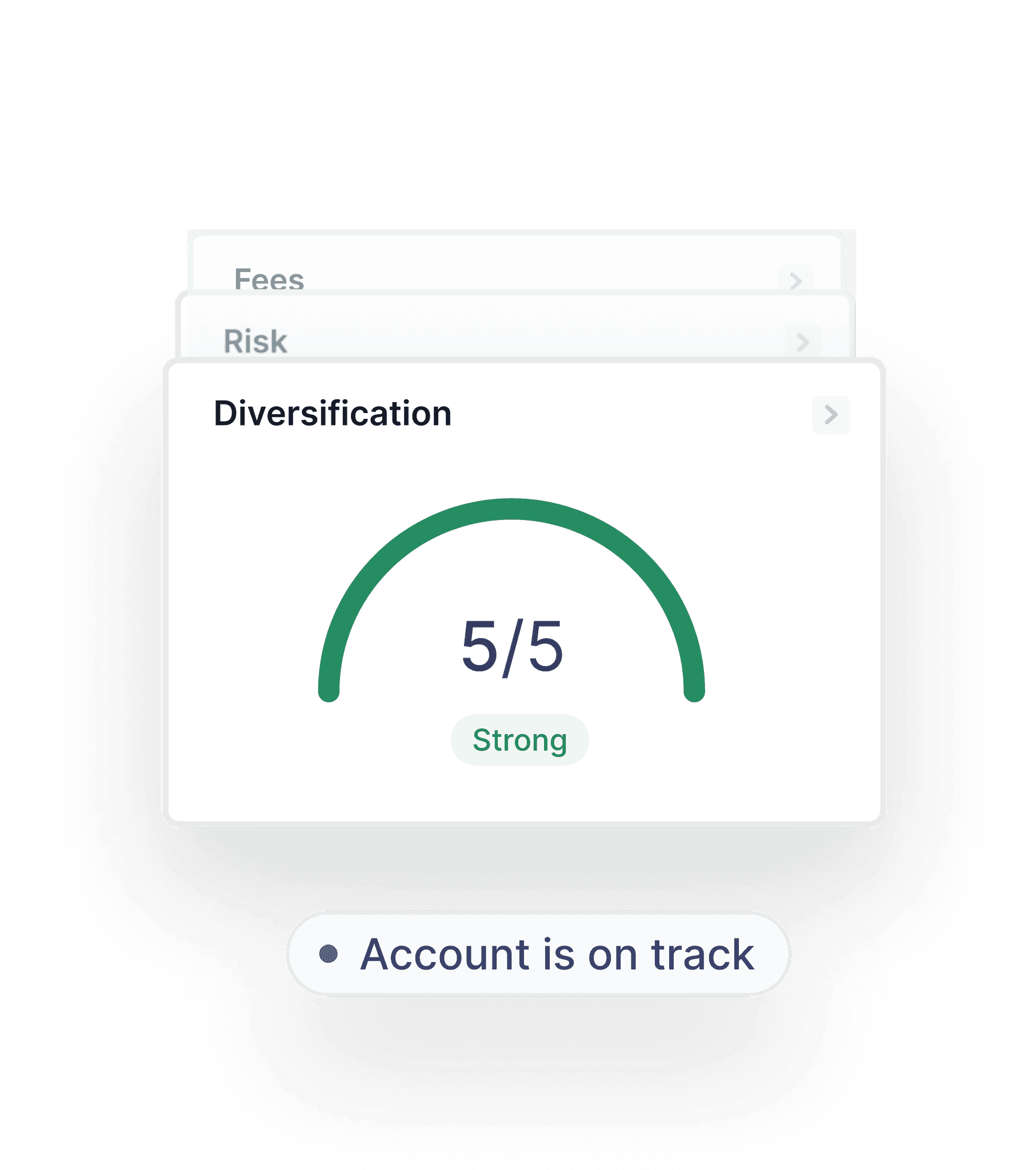
Final Design
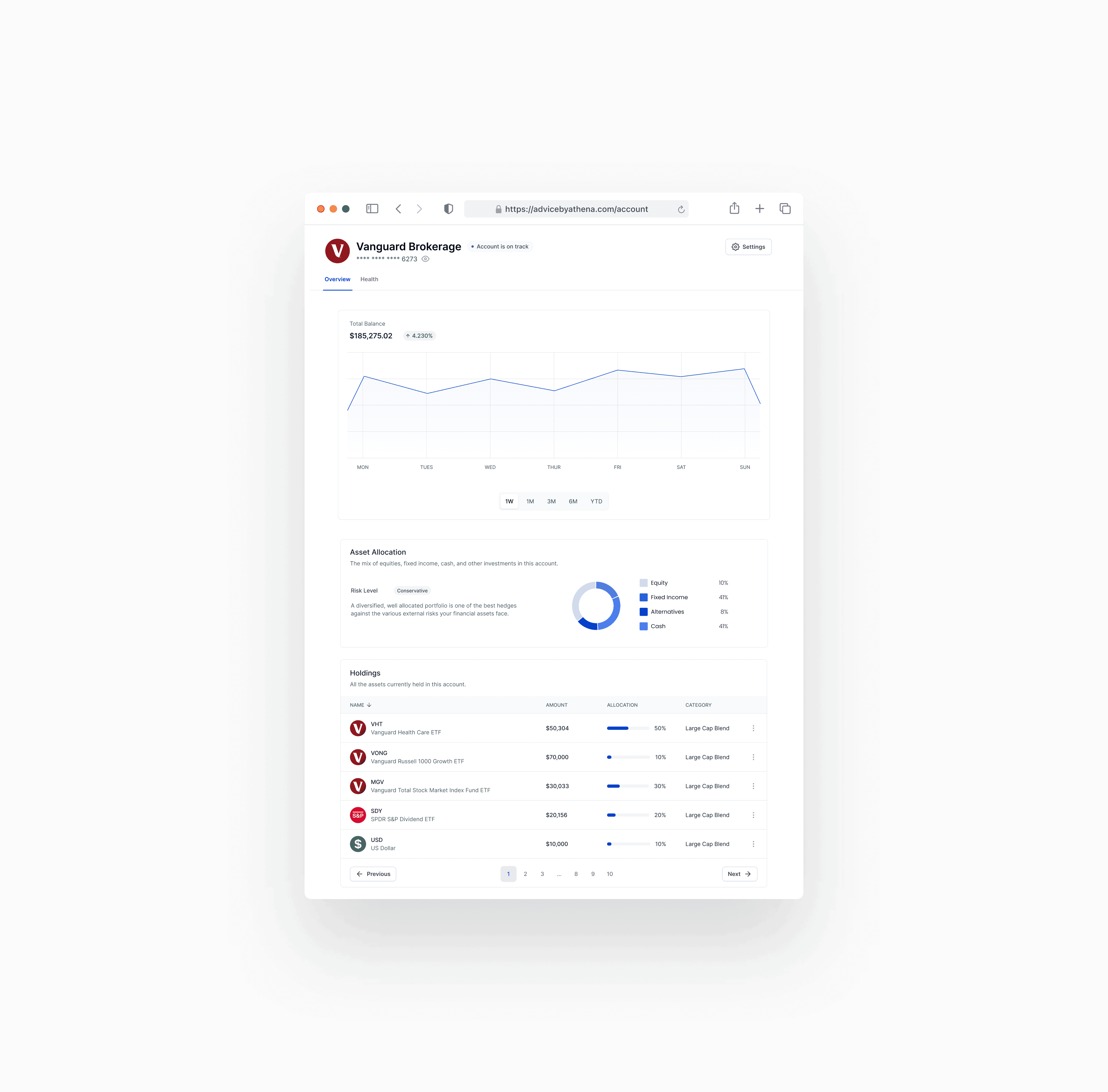
We defined a visual language and consistent card structure for the final health scorecard design. It's quick to scan, approachable for users at any level, and makes it easy to an quickly assess performance across multiple accounts.
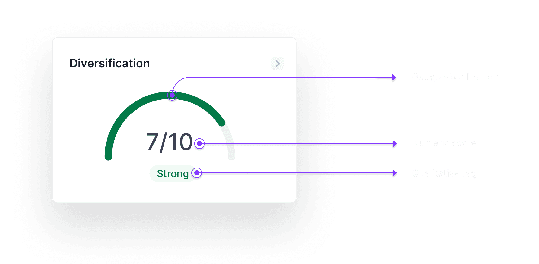
Clear Language

5-Point Gauge

Color Cues
Challenge 2
Problem
While some insights were visible, users were left without clear, contextual recommendations. They needed guidance tied directly to what they were seeing, without being overwhelmed.
Research Insight
“Even if I know something’s wrong, I don’t know what to do about it or where to start.”
How Might We
Guide users to take meaningful action on their investments?
Exploration
I narrowed my explorations down to three distinct interactions.

1. In-Line
Displayed recommendations directly beneath each scorecard for immediate visibility.

2. Hybrid
Cards expanded to show insights, with an optional modal for more detail.

3. Modal
Kept scorecards clean and opened recommendations in dedicated modals.
Prototyping
& Testing
Over the course of one week, I ran six remote, moderated sessions with active Athena users using our prototypes.

KEY INSIGHT
Modal Layout emerged as the clear winner. It maintained a clean, scannable layout and encouraged focused, meaningful engagement. The Hybrid Layout mixed interaction patterns confused users and the In-Line Layout felt cluttered and made it hard to parse multiple insights at once.

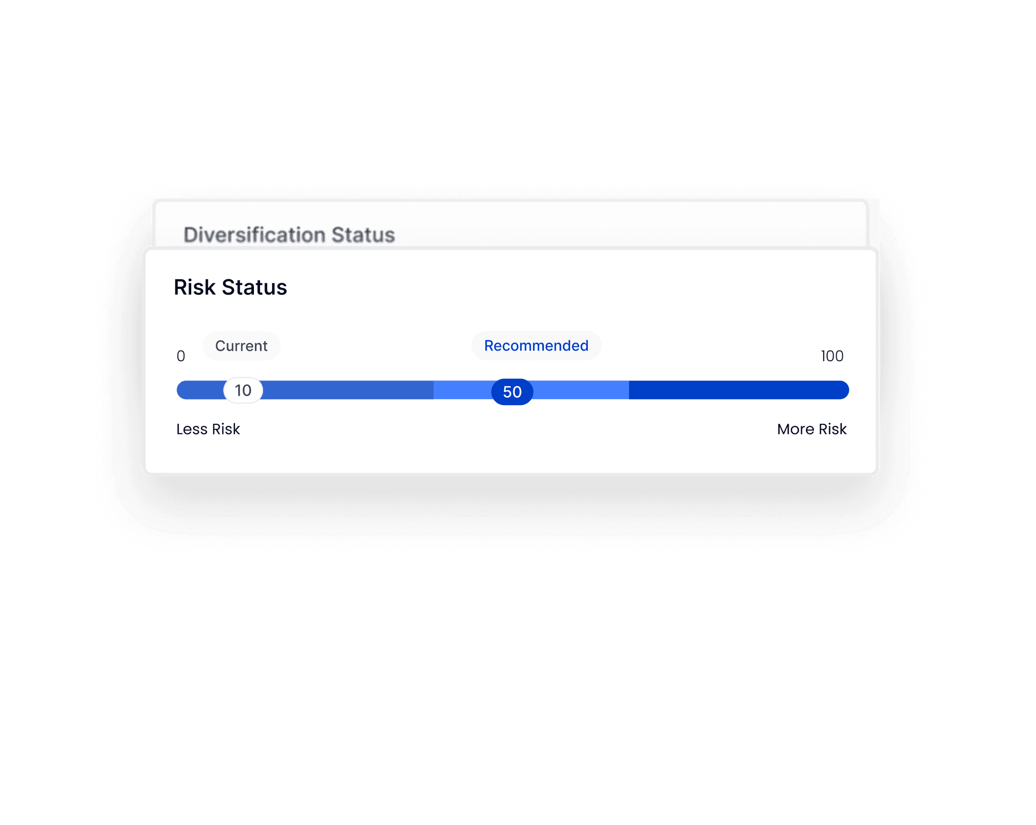
Final Design
Our final design surfaces tailored guidance in modals so users can dive into specific insights without distraction. It aligns with our goal of helping users make meaningful, focused decisions without cluttering the core experience.

Challenge 3
Designing for Business Goals
Problem
The benefits of switching to a managed account were buried and abstract. Users needed to see tangible, personalized reasons to justify the switch—without feeling pressured.
Research Insight
"Why would I pay for a managed plan? What’s in it for me?”
How Might We
How might we clearly show the value of switching to a managed account?
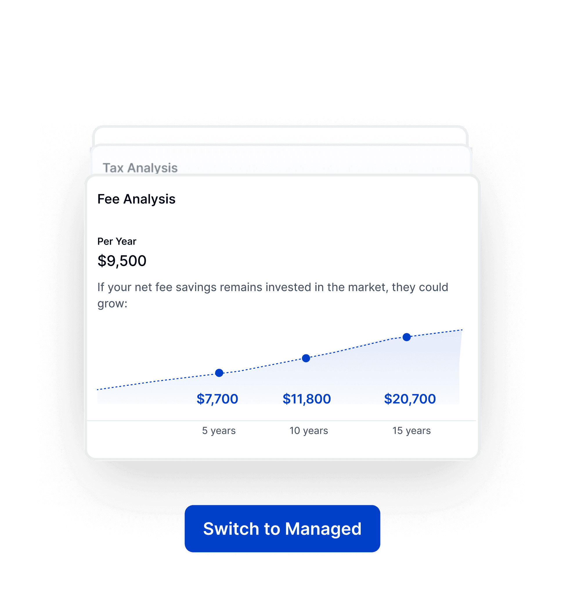
Final Designs
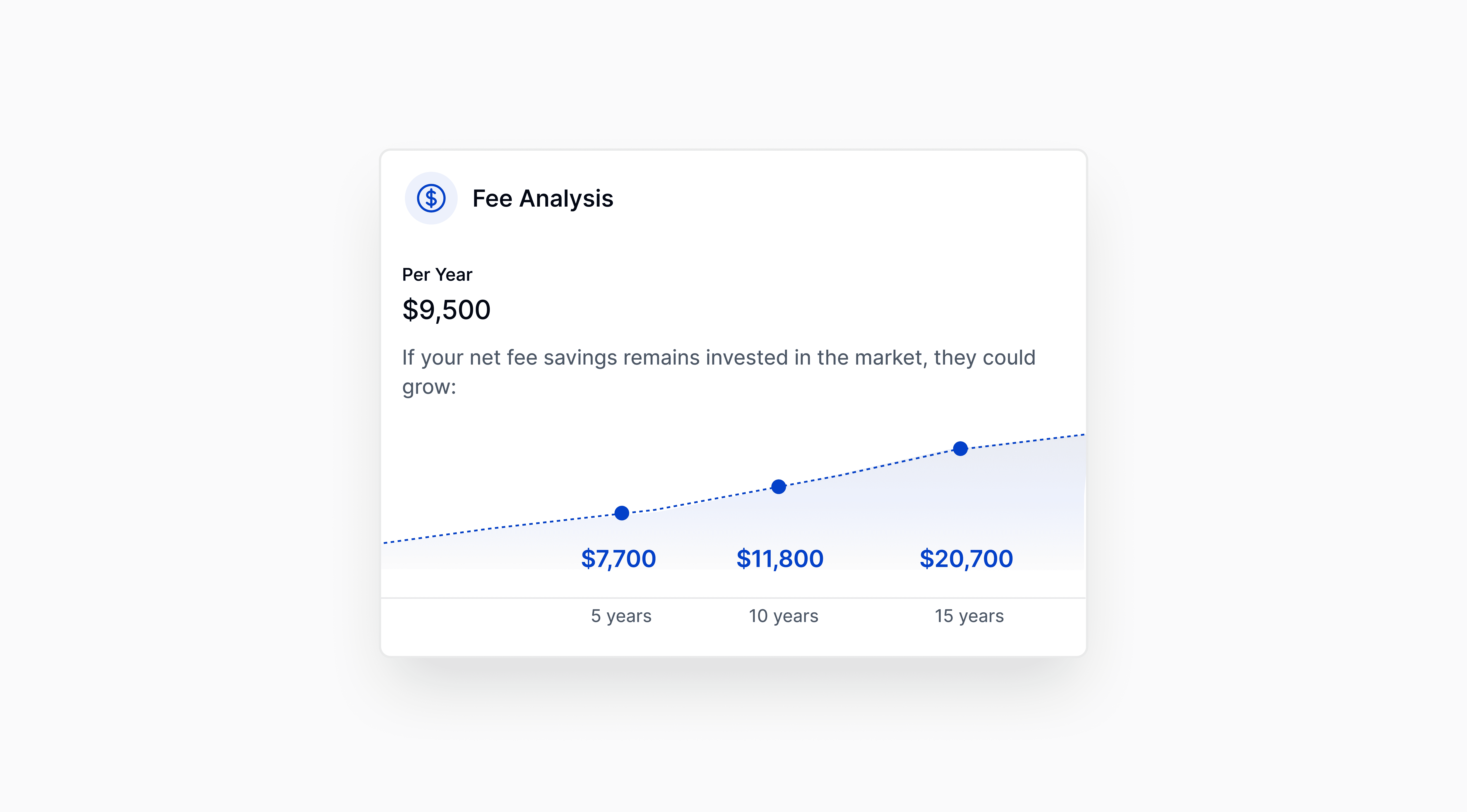
I designed a dedicated Managed Account Benefits section. This framed the opportunity cost of inaction by surfacing high-impact but often-overlooked advantages.
Each card highlighted a specific benefit with personalized, data-backed context. By quantifying these “intangible” perks, we helped users see not just what they were missing, but what they could gain.


07
Collaboration
I worked closely with engineering and data to validate what was feasible in the MVP timeline while still meeting user needs. I also aligned stakeholders across product and partner success teams on prioritizing intermediate users—a strategic decision that balanced business impact and user value.

Results
30%
faster feature delivery
40%
fewer UI bugs in production
Reflections
Composite metrics are easy to scan—but hard to trust.
We initially explored using a single score to represent account health. While it looked clean, users felt confused and judged, not informed. This taught me that even the most elegant data display falls short if users don’t understand what’s driving it or how to act on it.
Designing for B2B2C sometimes means designing without context
Because our users were coming through enterprise partners, they often had no onboarding, no prior knowledge of Athena, and no idea what they were looking at. This forced us to make every interaction self-explanatory, every layout intuitive, and every insight feel relevant since we could not expect brand trust or training.