Developing a foundation for scalable design
Launching Uplift, Edquity's first design system
2021 / Design System
Senior Designer
Project Overview
Team: Two Senior Product Designers, visual designer, front-end developer
My Responsibilities: End-to-end design process spanning research, problem definition, solution exploration, ideation, rapid prototyping and testing, brand/visual identity
Timeline: June - September 2018
I worked with Design and Engineering to launch Uplift, Edquity’s first Design System. Though it required a lot of up-front work, it proved valuable in the long-run by minimizing design process inefficiencies, maximizing our team’s output, and streamlining collaboration with our Development team. Uplift has been a tremendous force in the progressive unification of Edquity. Uplift has become the epicenter of evangelizing design, interactions and experiences across the org. Other than managing and creating an ever-changing need for patterns, it is expanding to evangelize Edquity's new brand expression, global standards, and also Design strategy principles.
The Problem
As our design team grew, a new challenge emerged: managing effective design at scale. As we tried to scale our processes, products, and people we ran into the following challenges:
Multiple designers and stakeholders
As our product team grew, we found that the challenge to create coherent experiences multiplies exponentially as more people are added to the mix. This lead to divergent experiences across products and platforms due to UI inconsistencies and a lack of standardization/agreed upon rules for the system. Designers and developers had been historically working in silos, with each team creating their own UI, logic, and UX patterns with little consensus and guidance holistically.
Multiple products and platforms
As our product offerings grew, keeping features and designs synchronized grew complicated and required the same work to be repeated across all of these platforms. As more people were thrown into the mix, our design and development processes decelerated.
We needed a systematic way to guide and leverage our collective efforts.
Process
We began by studying best-in-class design systems. Thanks to the emergence of the open source design movement, we could do a deep dive on complex and well-documented design systems from companies like Google, Airbnb, Atlassian, and Salesforce.
Taking Inventory
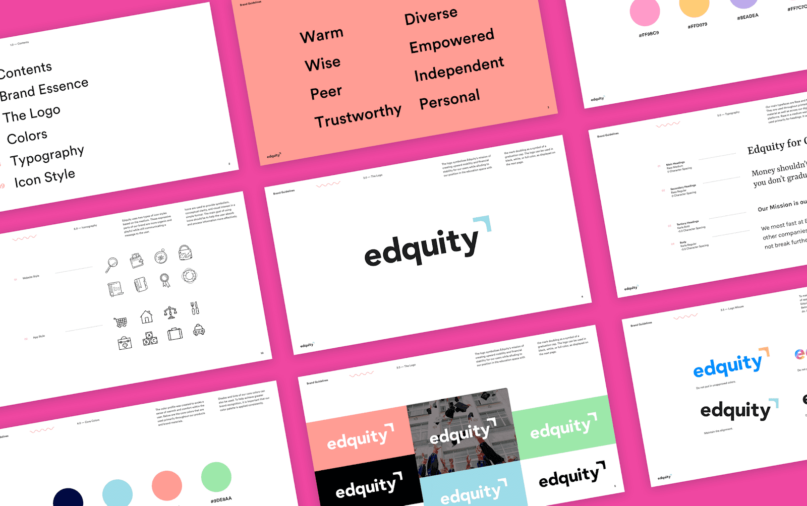
The next step towards building our design system was conducting a painstaking audit of our existing designs. We went through our Sketch files (we had not transitioned to Figma at that point) and took an inventory of every single button, icon, form field, text field, and design pattern that existed. We discovered a multitude of inconsistent icon styles, incorrectly applied font weights, unstandardized naming conventions, and single-use components.
The Approach
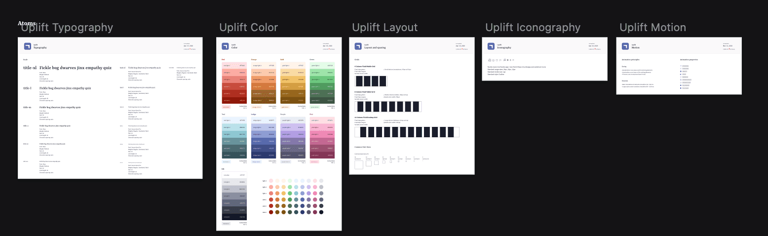
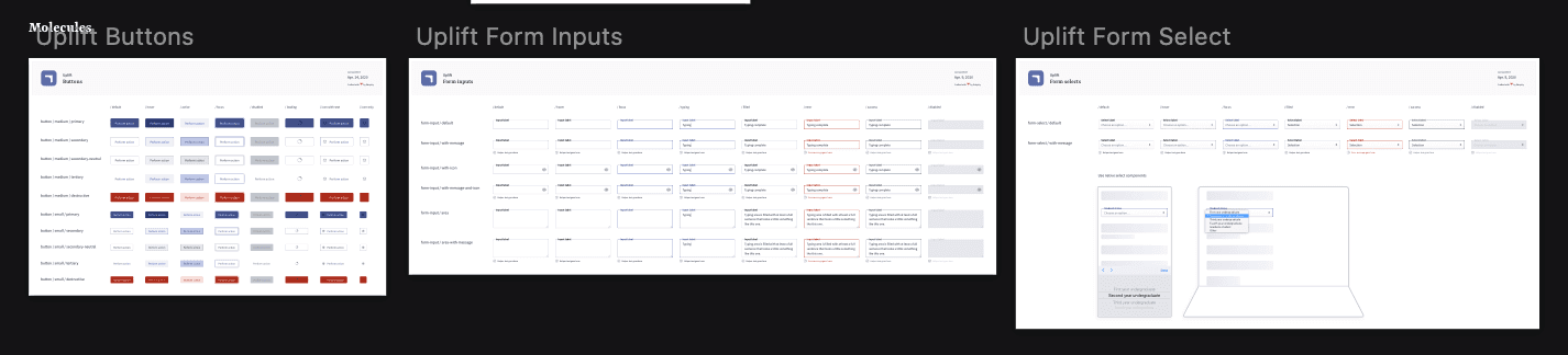
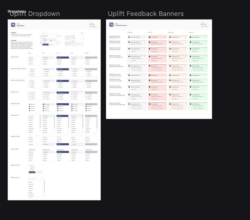
Inspired by Brad Frost’s Atomic Design methodology, we decided to adopt an atomic design framework for our design system. Atoms are the foundational building blocks that comprise all user interfaces, like buttons, icons, and fields. Modals, menus, forms, and any other interface elements a designer or developer may need are simply a combination of atoms. Once we had our atoms, we identified the most common combinations of atoms. These functional elements became our ‘molecules’.
Breakdown of Edquity Design System
Next, we had to make some tough decisions about conventions, categorization, organization, and presentation.
Atoms:
Molecules:
Organisms:
Implementation
Design
We created a master Sketch file and connected all new and existing design files to the components in the library. Changes to components made in our design system were reflected throughout all our wireframes. A design system is only actionable when designers know how and when to use its components, so we developed a system of rules, implementation guidelines, and design principles to codify and contextualize usage.
Development
We worked closely with our front-end developer to standardize and implement code snippets for existing elements and layout guidelines for the creation of new patterns using Storybook, a development environment for UI components.
Lessons Learned
Design systems are evolving ecosystems and should be treated as such. As designers, it is incumbent on us to: i) establish and honor processes for ongoing design system maintenance and ii) foster cross-functional collaboration and buy-in as early on in the process as possible, We didn’t know we needed a design system until it’s too late. By the time we start thinking about creating a design system, we already had hundreds of Sketch artboards that lived in disparate, massive Sketch files