Athena Dashboard

Introduction
As the Lead Product Designer at Athena, I led the end-to-end redesign of Athena’s investment dashboard, responsible for redesigning the delivering clear portfolio overviews, performance trends, asset allocations, and actionable next steps.
Timeline: June - September 2024
Team: Lead Engineer, CEO, Product Manager, Data Scientist, Customer Stakeholder
My Contributions:
Defined and prioritized Phase 1 scope through mixed-method research
Conceptualized and validated a modular card-based information architecture through rapid prototyping and user testing
Established a cohesive visual design system. Defined typography scales, color tokens, and reusable card components
Drove a 1.9× lift in engagement with account insights and a 22% increase in managed-plan conversions post-launch
Introduction
As the Lead Designer, I led the design of Athena’s account experience leading to a 39% uptick in our core business goal of managed account adoption.
Impact: $12M increase in AUM within 3 months of rollout
Outcomes
Because we reframed simplicity as a growth lever, the new dashboard drove a 1.9× lift in account‑insight exploration, a 22% bump in managed‑plan sign‑ups, and laid the foundation for a 30% reduction in front‑end build time. Those results secured buy‑in from two new enterprise partners for Q3.
Background
Athena is an AI-powered financial advisor. We partner with retirement and wealth management firms to serve customers who don’t qualify for traditional advisors.
This case study focuses on redesigning the portfolio management experience, a core feature that helps users track, assess, and improve their investments.
The Problem
There were three problems with the legacy experience.
old experience
1. Over-reliance on chat
Insights were hidden behind “Ask Athena,” which many users ignored.
2. Flat, contextless data
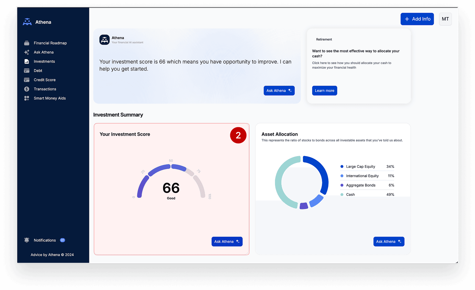
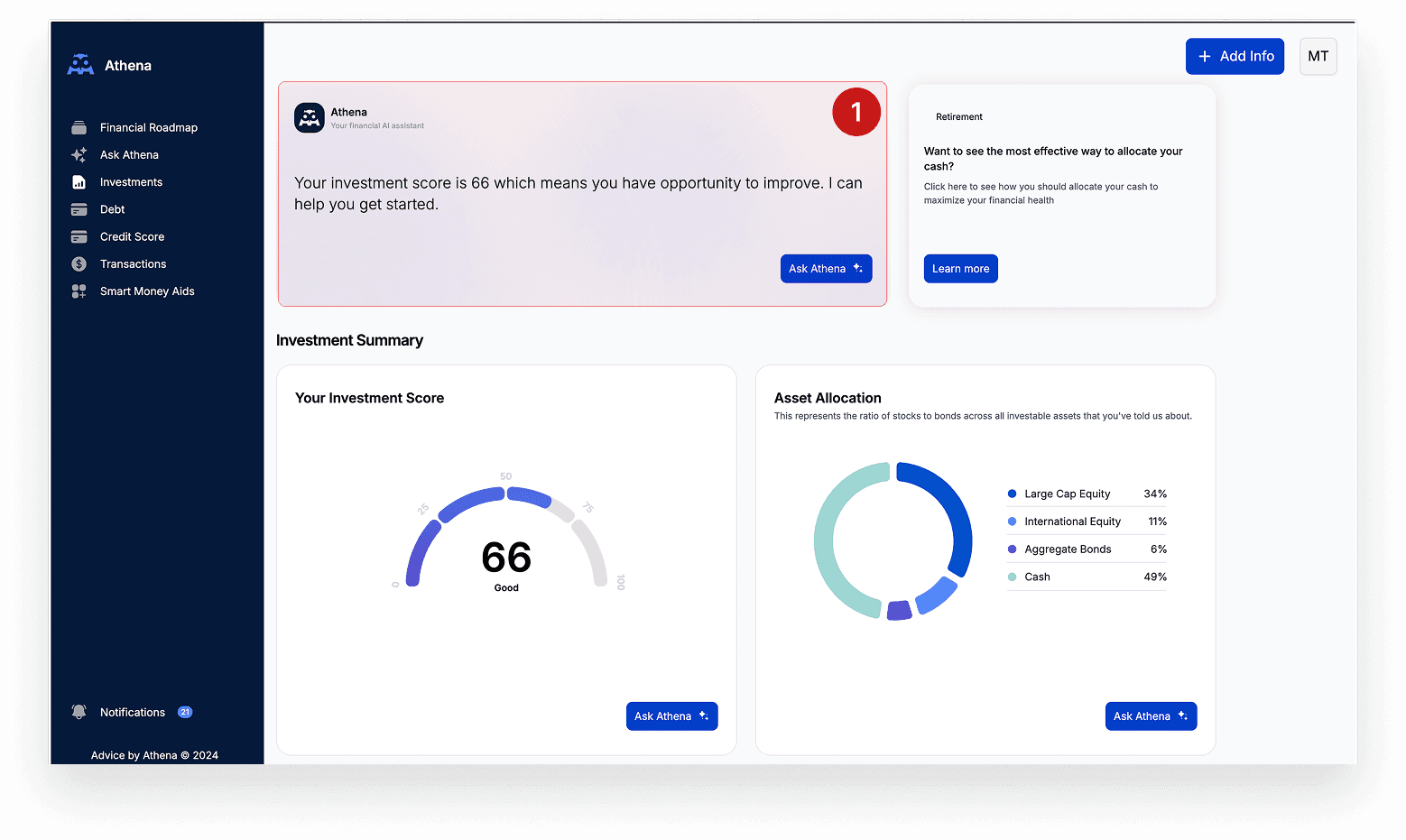
Metrics like investment scores were shown without explanation or next steps.
3. Missing big-picture view
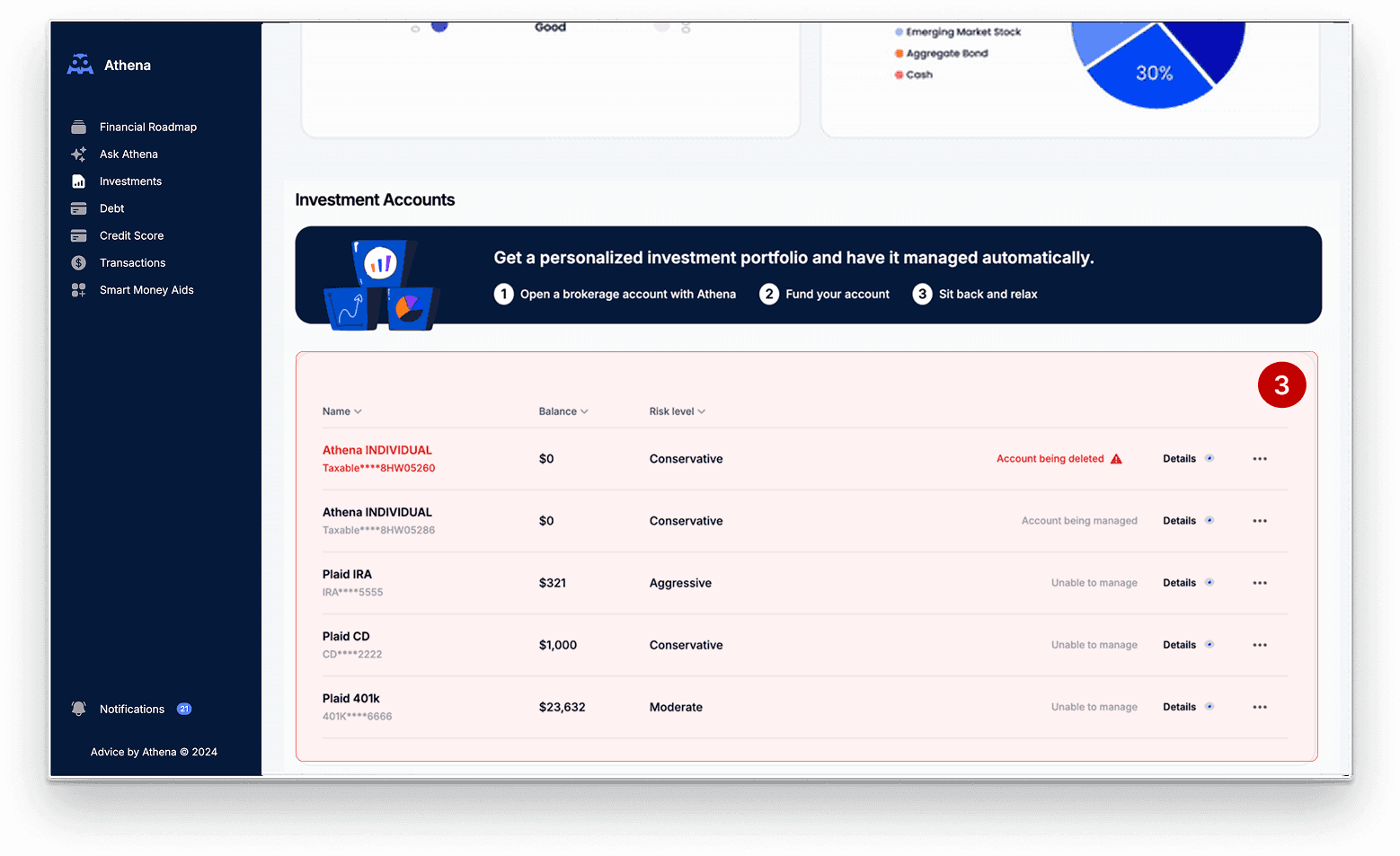
No account breakdown or trend tracking made it hard to assess portfolio health.
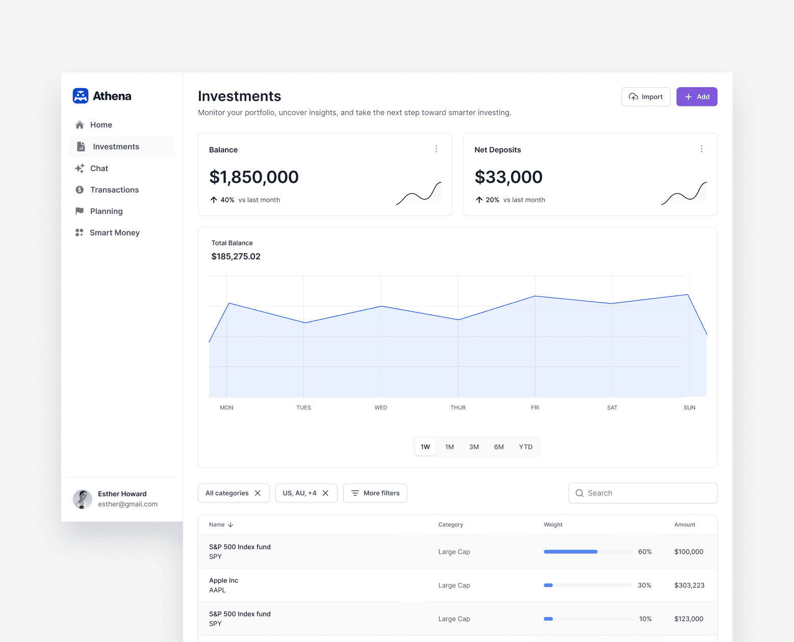
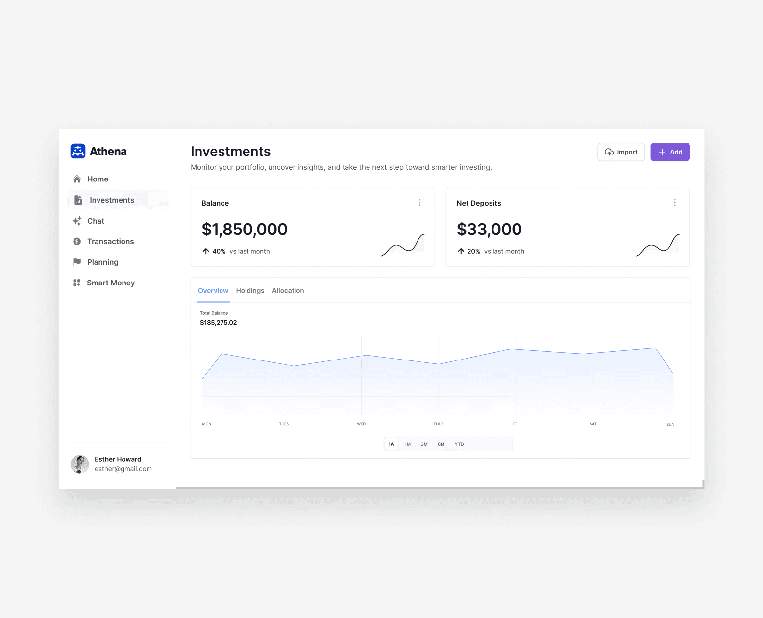
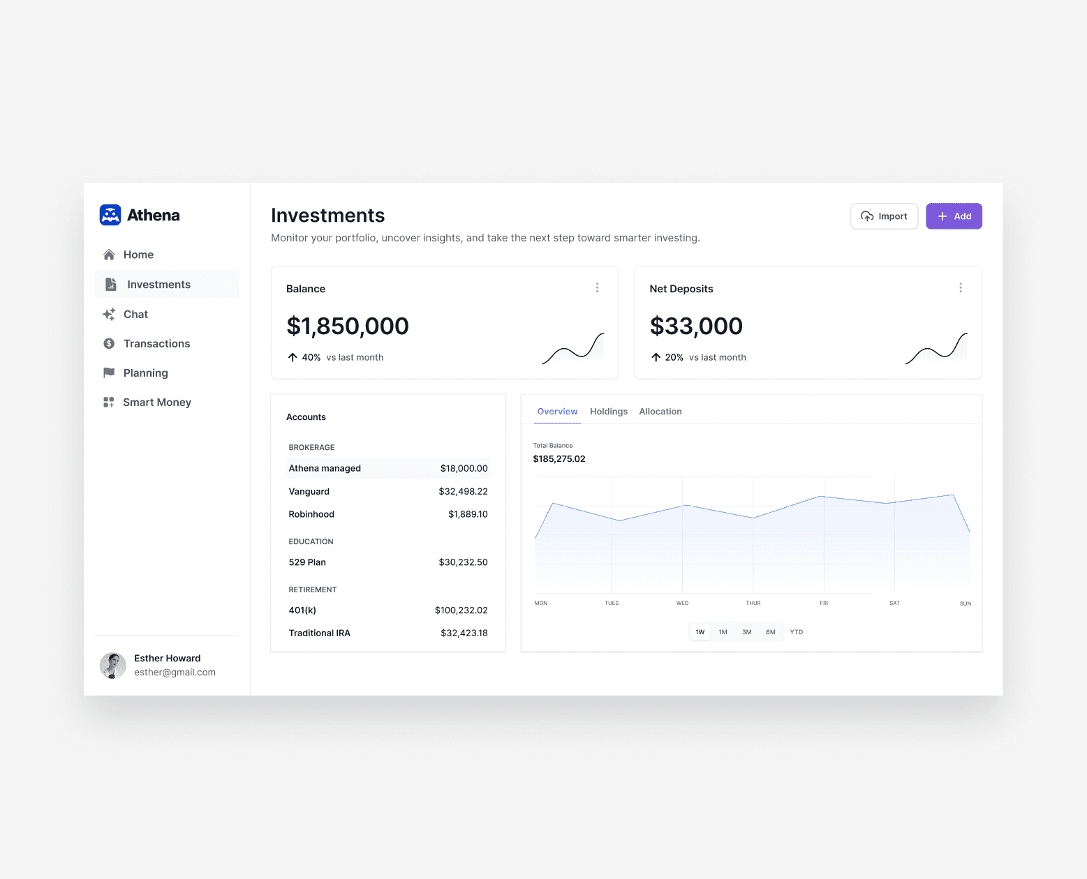
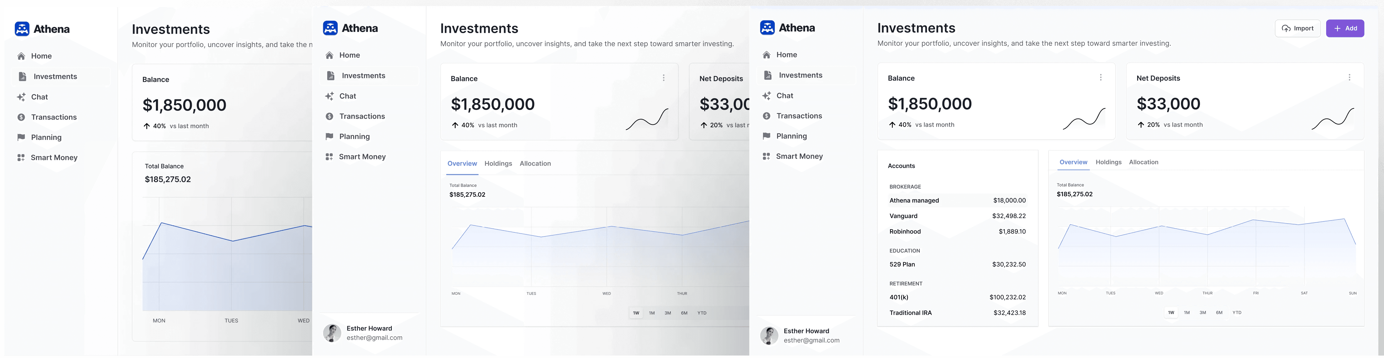
The Solution
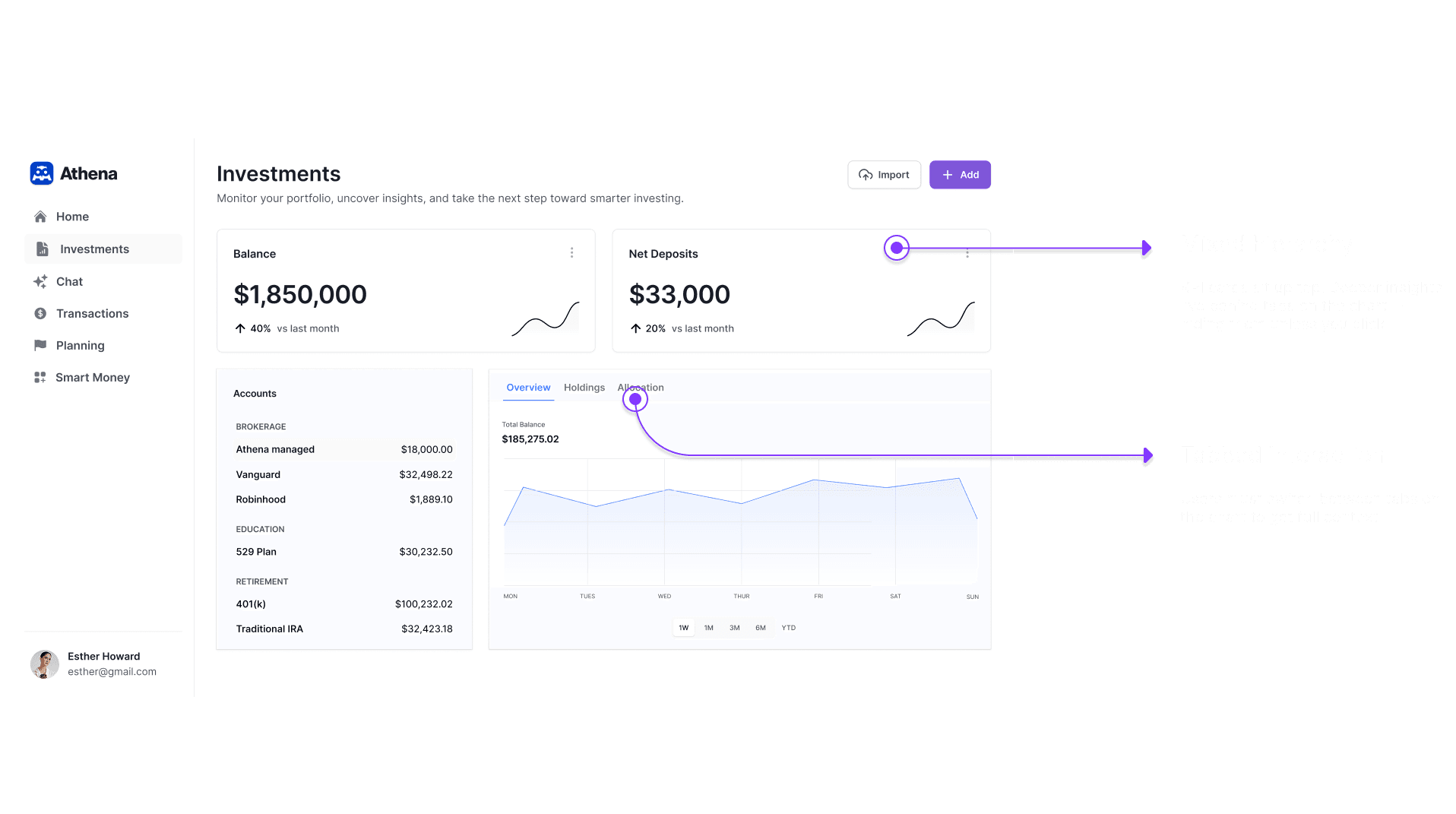
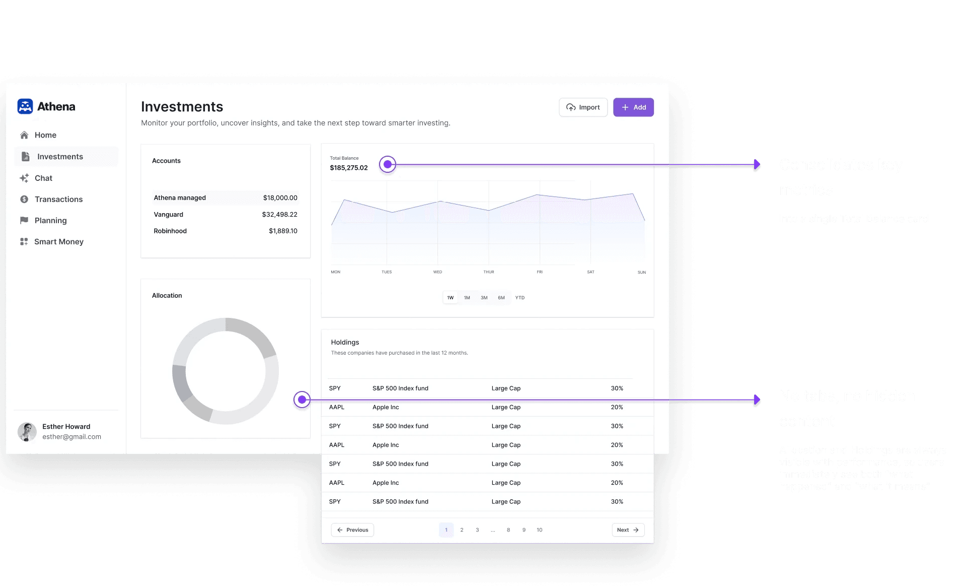
We redesigned Athena’s dashboard into a modular, no-nonsense interface that surfaces balances, performance trends, asset allocation, and clear next steps all above the fold—so investors can act with confidence from the moment they land.
Before
Generic score with no explanation
No trend data or time filters
Relies on chat to explain insights
After

Account types clearly broken out
Performance graph with selectable time ranges
Modular structure
Results
2X
Daily active users on the Investments page
40%
reduction in support tickets about “where to start” on the dashboard
35%
of users clicking into the Health Scorecard components

Case study starts here
01
Research
I collaborated cross-functionally to uncover investors’ core objectives: what “success” looks like for them, which metrics they prioritize, and how they currently navigate other platforms for portfolio insights.
Support ticket analysis — 27% of tickets cited confusion over account breakdowns underscoring the need for a clear, consolidated account panel.
Datadog analysis — Clickstream data showed 45% of users bounced before engaging any insights—largely because key modules lived below the fold.
Competitor analysis — While competing apps offer polished portfolio visuals, none provide inline, personalized next-step recommendations
02
Insights & Opportunities
From our research and testing, we distilled four guiding themes to drive every design decision:
Move from data dumps to insight-driven visuals
Swap encyclopedic tables for focused charts and scorecards that surface the signal, not the noise.
Favor modular, scannable components
Break the dashboard into standalone cards so users can instantly find what they need and explore deeper on demand.
Build trust through context and clarity
Pair every metric with plain-language explanations and tooltips, reducing ambiguity and reinforcing data credibility.
Empower action with in-place guidance
Embed clear, next-step recommendations and CTAs—so users can move from “What’s happening?” to “What do I do next?” without leaving the dashboard.
03
Defining Scope
Our research showed every investor arrives with four burning questions. We translated those into these four core dashboard features.
“What do I own?”
Accounts Overview
List all connected accounts with live balances.
“What’s driving my portfolio?”
Holdings Overview
Highlight top performers an top holdings.
“Is my portfolio diversified appropriately?”
Asset Allocation Chart
A chart breaking out Equity, Fixed Income, Alternatives, and Cash.
“How is my portfolio performing?”
Performance Trend Chart
An interactive chart of portfolio value with selectable timeframes.
How Might We
Design an investment dashboard that presents key information and clear next-step recommendations in a single, coherent view?
04
Exploration
1. Data-first
Prioritized raw visibility with inline tables and filters.
2. Tabbed
Introduced structure and hierarchy to allow users to move from summary to detail at their pace.
3. Hybrid
Combined summary, scorecard, and account panel.
05
Prototyping
& Testing
Over the course of one week, I ran six remote, moderated sessions with active Athena users using our prototypes.
KEY INSIGHT
Hybrid Layout emerged as the clear winner. Users completed tasks 30% faster, scored 92% first-click accuracy, and praised its balance of overview and drill-down.

06
Iterations
Our Hybrid layout gave us a quick win but it still felt too rigid.
The Hybrid Layout locked each module into a fixed position, forced separate KPI cards that ate up precious real estate, and made adding new insights a full-layout rewrite
Switching to a Modular grid by combining KPIs to free up space and reduce visual clutter. I focused on decoupling panels, standardizing card anatomy, and building a reusable design framework
07
Technical Constraints
I worked with engineering and data to identify technical constraints. By catching these constraints early on we made strategic trade-offs in order to ship a polished MVP on time while still building a foundation for future enhancements.

This part
Inconsistent data from aggregators
Our chosen data provider (Plaid Investments) only returns end‐of‐day balances so minute‐by‐minute charts were out. We shifted to a daily trend chart with cached values to ensure reliable performance.
Chart performance at scale
Initial D3‐based prototypes lagged when rendering weeks of data across multiple accounts. To meet our deadline, we swapped to a lightweight Chart.js implementation with pre-aggregated data points.
08
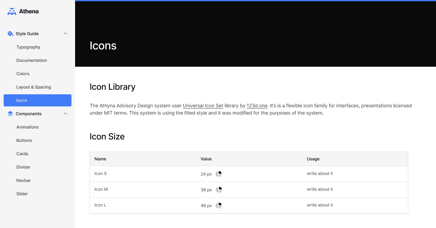
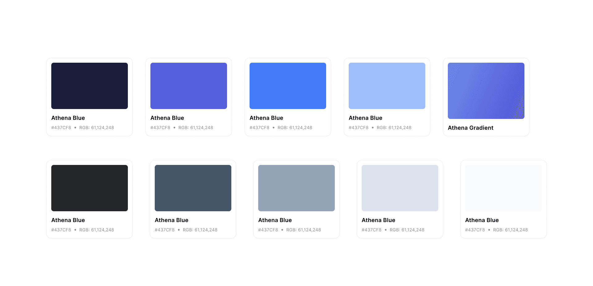
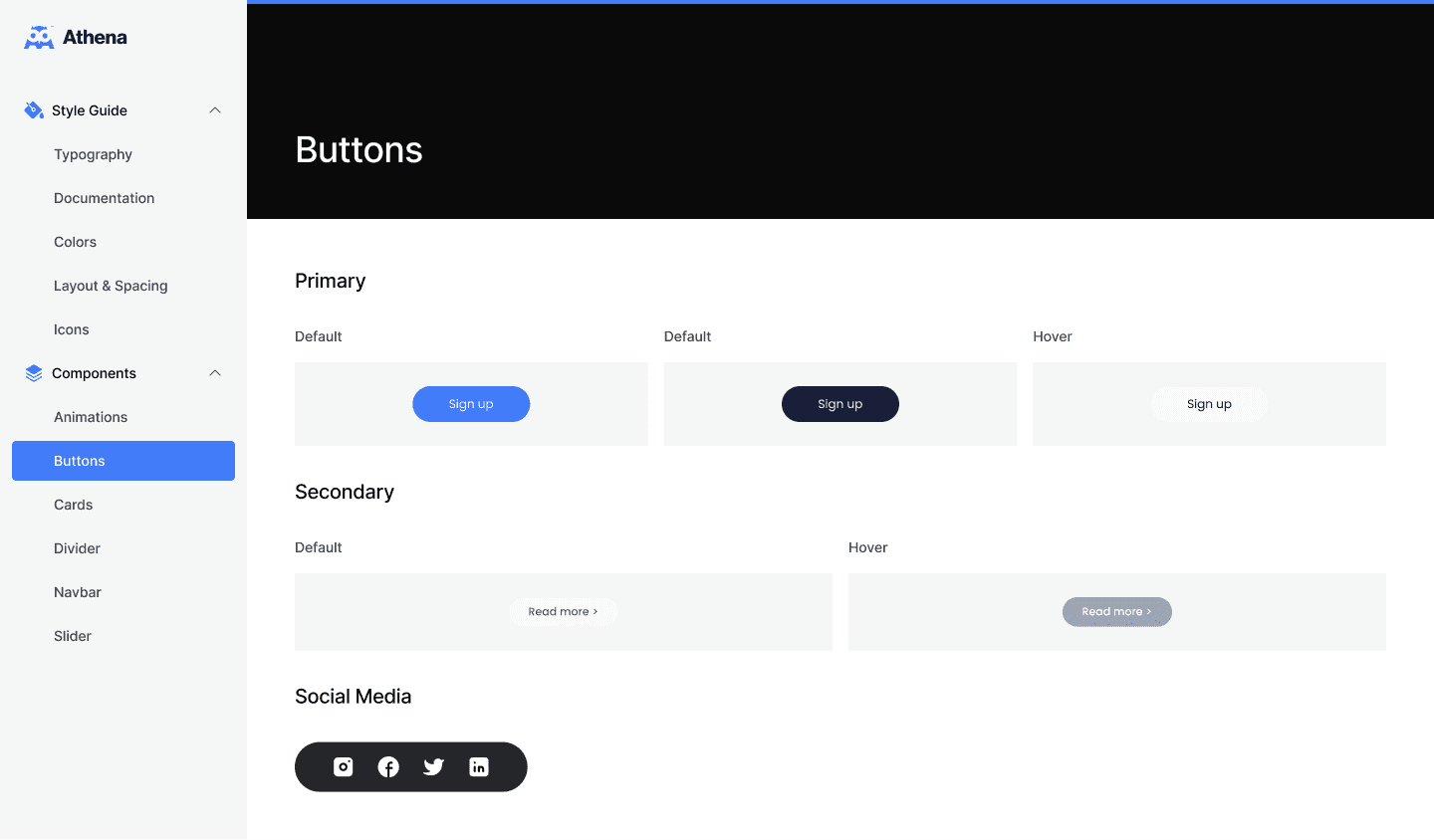
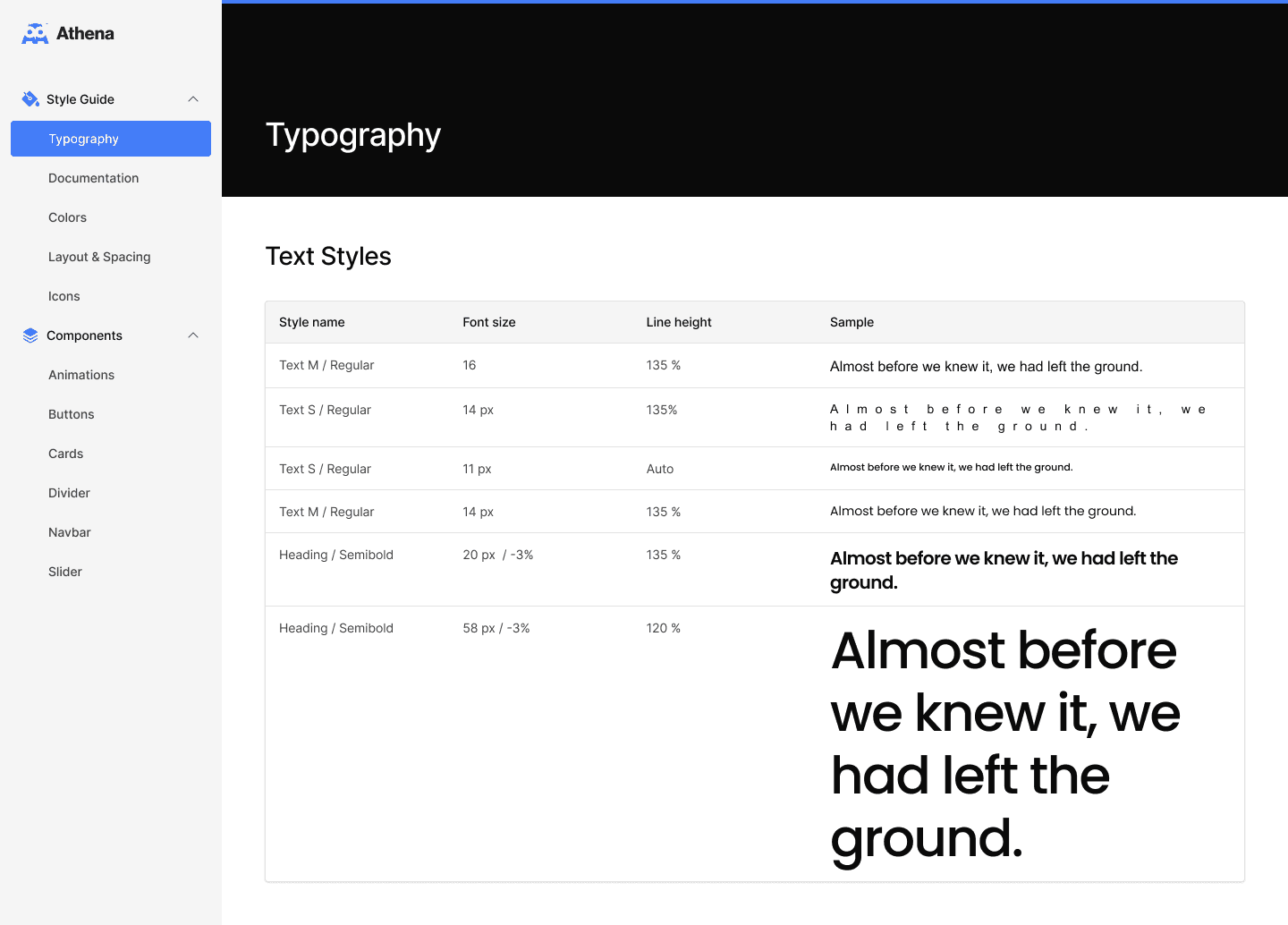
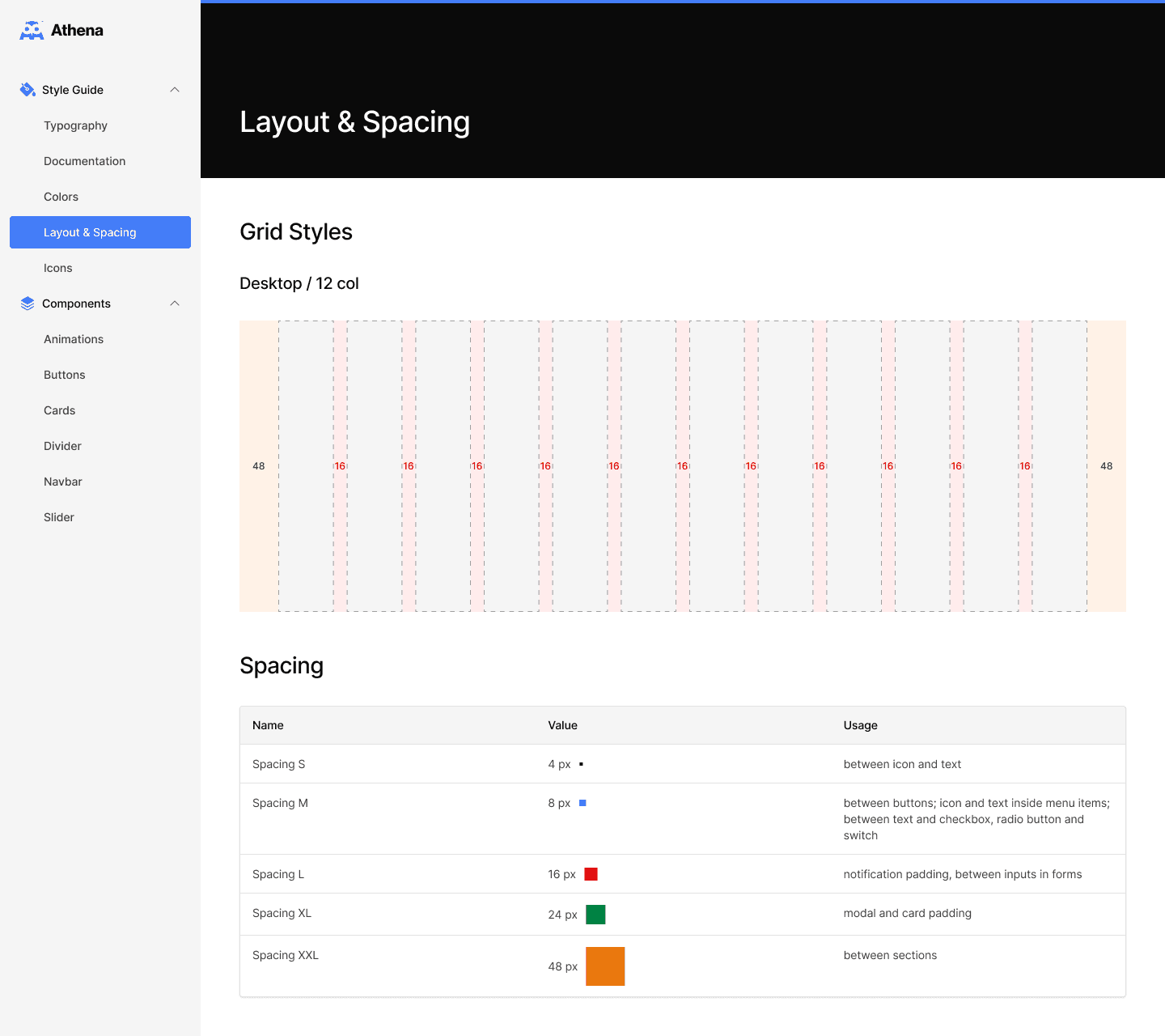
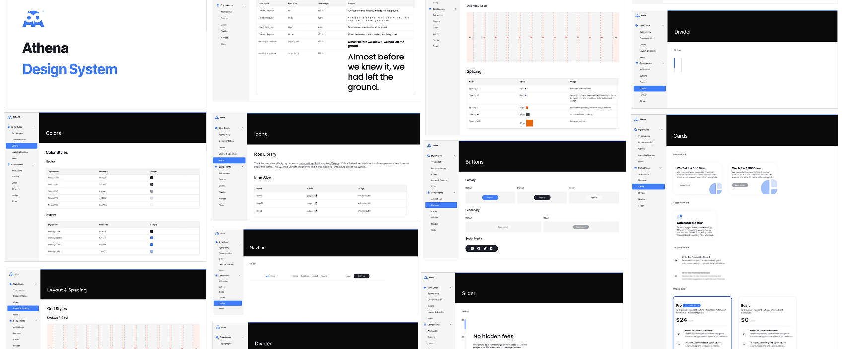
Design System
We distilled the new dashboard UI into our first Design System and style guide.
Results
30%
faster feature delivery
40%
fewer UI bugs in production
09
Final Designs
I designed, tested, and handed off the final designs in a rapid six-week cycle—two design sprints with weekly engineering syncs—so we hit our Q3 release date.
Reflections
Iterate to the right balance
Our three-phase layout tests—from raw data tables to tabbed modules to the final hybrid view—helped us optimize for both depth and scanability, driving a 27% lift in time spent on performance and allocation charts.
Invest in a living system
Formalizing Athena’s colors, typography scale, spacing tokens, and reusable cards cut front-end build time by 30% and ensured every new feature slots seamlessly into the dashboard without visual drift.
Feedback
"It finally felt like I had a command center for my accounts—not just a bunch of charts."
Athena User
"This dashboard finally gives our clients clarity without overwhelming them. It’s streamlined, but still powerful."
Financial Wellness Officer
“I used to bounce between screens to find where my IRA was hiding—now that's a thing of the past!"
Athena User
"When the allocation donut immediately showed I was 85% in equities, I rebalanced straight away—something I’d never have spotted so quickly before.”
Athena User