Athena Dashboard
Over an eight‑week sprint, I led the redesign of six key modules for Athena's investments dashboard—account aggregation, performance trends, allocation, holdings highlights, recommendations, and CTAs—to surface insights above the fold, reduce cognitive load, and boost engagement by 25%.
TIMELINE
June-September '24 (12 weeks)
TEAM
Lead Engineer, CEO, Product Manager, Data Scientist, Customer Stakeholder
ROLE
Principal Product Designer

Introduction
As the Lead Product Designer at Athena, I led the end-to-end redesign of Athena’s investment dashboard, responsible for redesigning the delivering clear portfolio overviews, performance trends, asset allocations, and actionable next steps.
My Contributions:
Defined and prioritized Phase 1 scope through mixed-method research
Conceptualized and validated a modular card-based information architecture through rapid prototyping and user testing
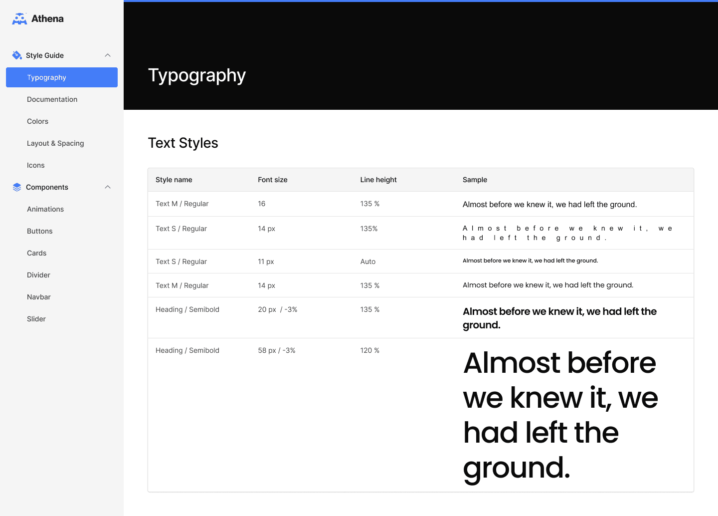
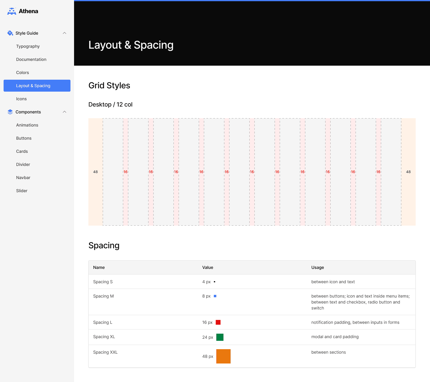
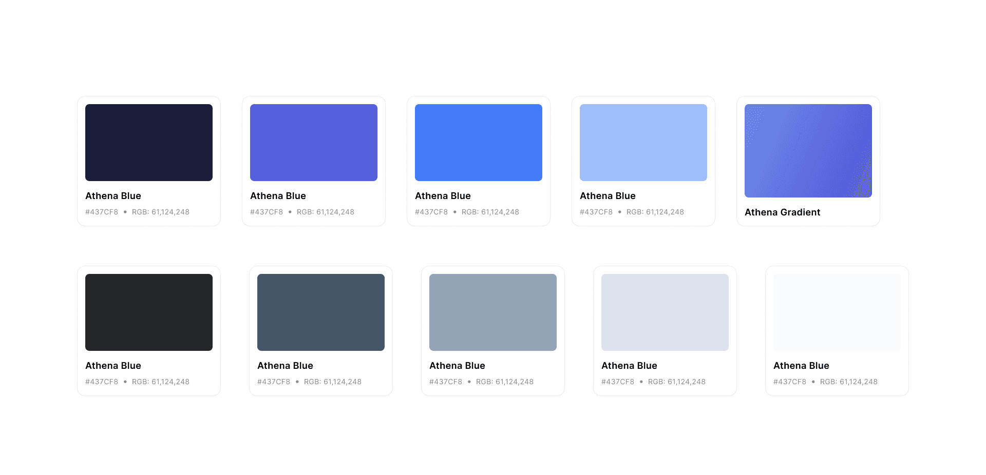
Established a cohesive visual design system. Defined typography scales, color tokens, and reusable card components
Drove a 1.9× lift in engagement with account insights and a 22% increase in managed-plan conversions post-launch
Background
Athena is an AI-powered financial advisor. We partner with retirement and wealth management firms to serve customers who don’t qualify for traditional advisors.
This case study focuses on redesigning the portfolio management experience, a core feature that helps users track, assess, and improve their investments.
Seeing if they’re “on track.”
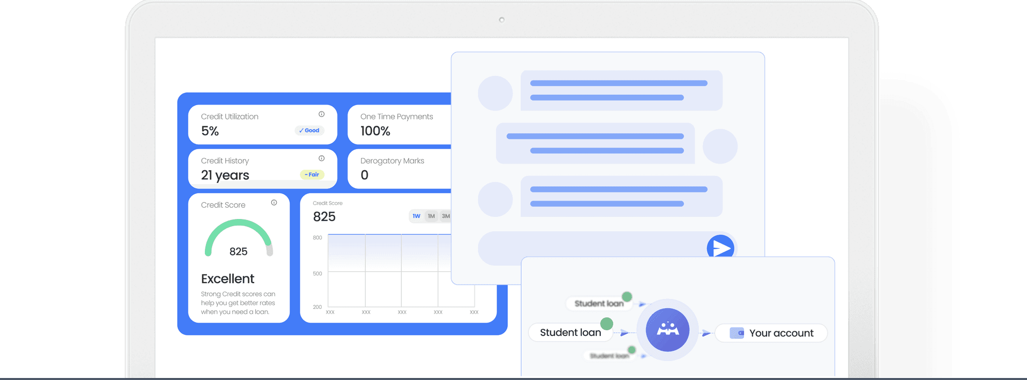
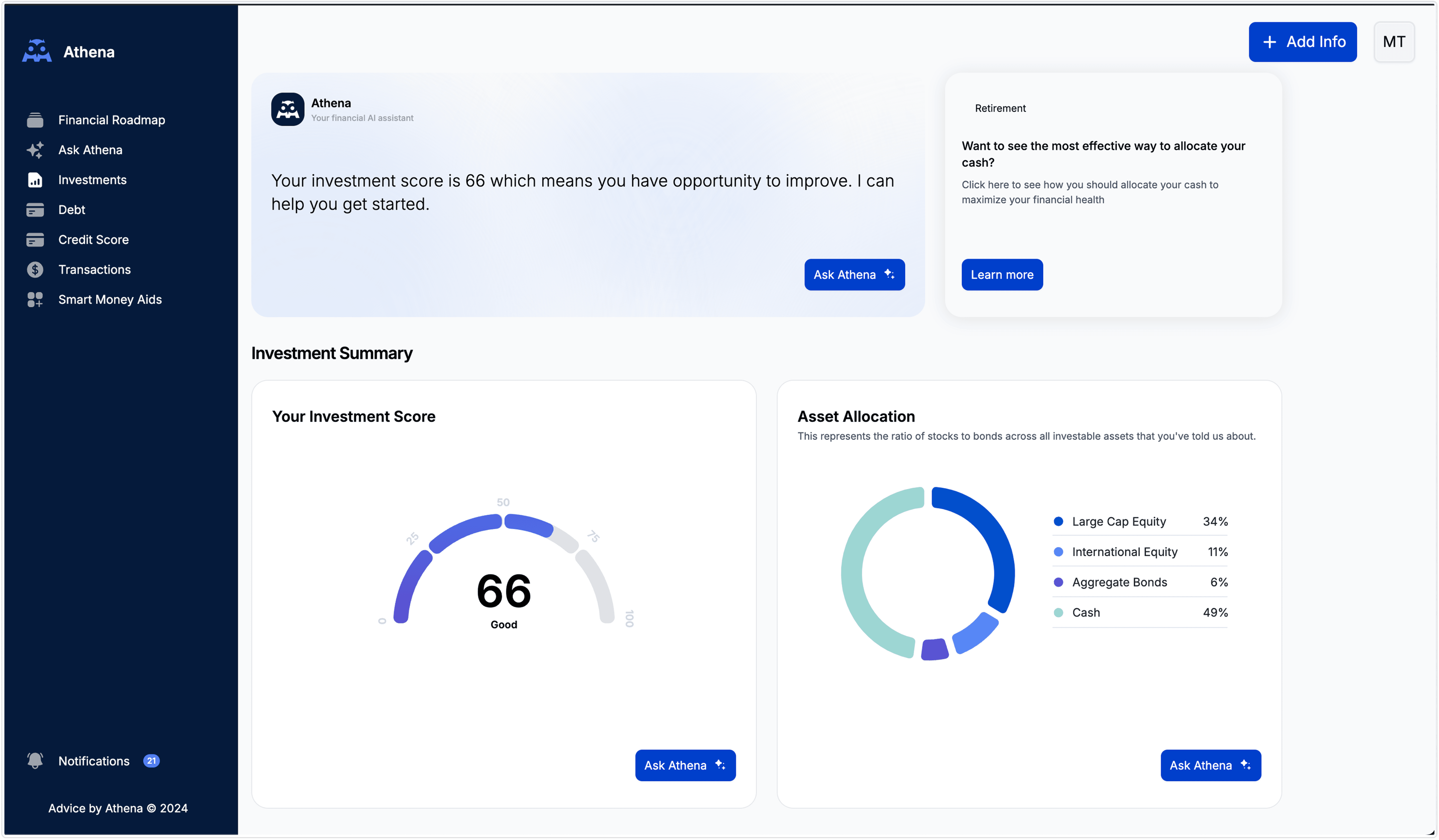
Nothing kills confidence faster than a mystery score. We replaced a buried modal with an always‑visible allocation donut and plain‑English risk tag—so you instantly know if your mix is too aggressive, too conservative, or just right.
Watching your money move.
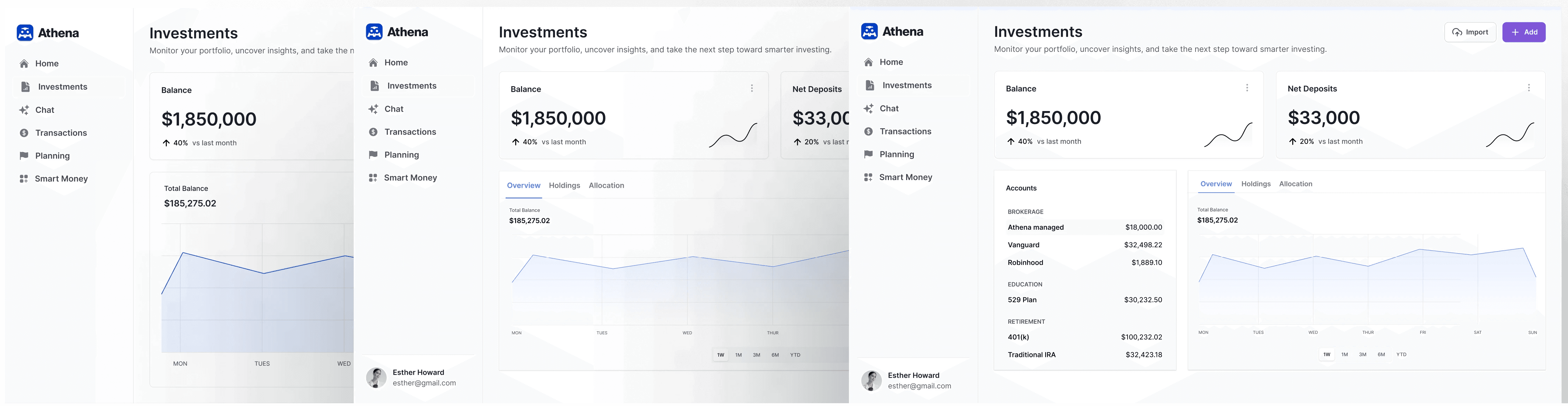
Instead of exporting CSVs, you get a “Total Value” line chart right at the top—dollars and percent change, toggles from 1W to YTD, no digging required.
Finding your accounts in one glance.
No more hunting through menus. We grouped every connected account—brokerage, retirement, education—into a single panel with live balances, so you see exactly where your cash lives.
Spotting winners and risks.
You want to know what’s driving returns and where you’re over‑exposed. Our side‑by‑side “Top Performers” and “Top Holdings” cards highlight your biggest gains and your capital concentrations in one view.
Moving from insight to action.
There’s nothing theoretical about your money. We built “Get My Plan Managed” and tailored recommendations into each module—so the moment you spot something off, you can fix it without switching screens.
Tracking Health
What they want: A clear sense of whether their overall mix is too aggressive, too conservative, or just right.
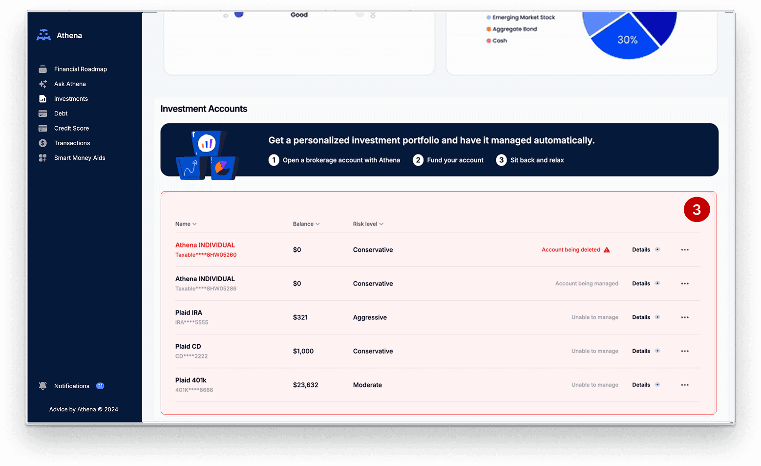
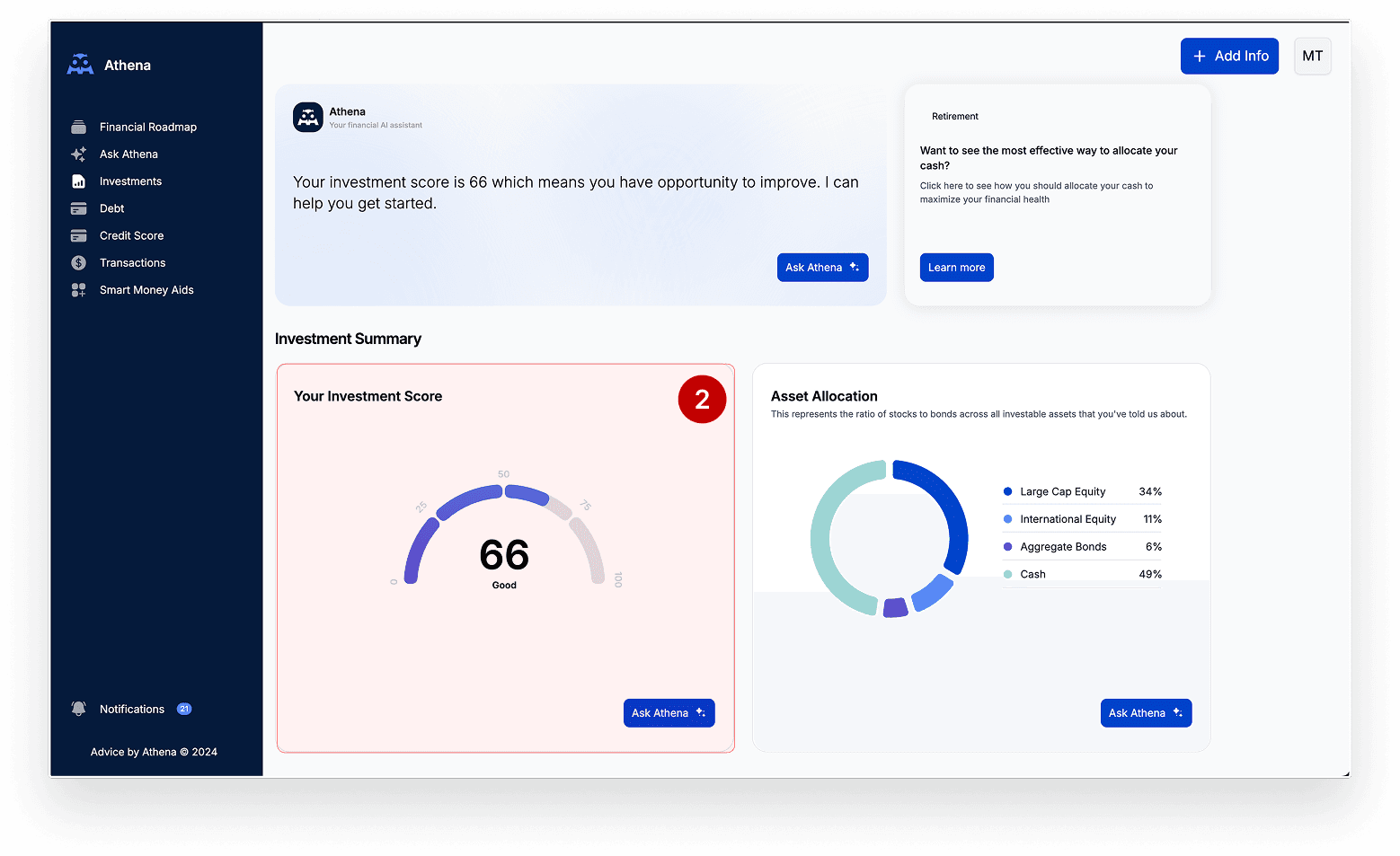
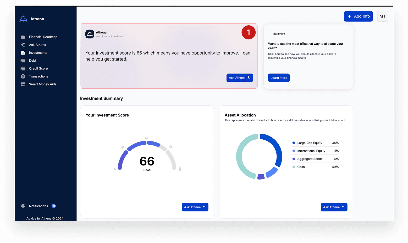
Design solution: We swapped a dense scorecard + modal combo for an always‑visible Allocation donut with a plain‑language “Risk Level” tag and tooltip—so users get instant feedback on diversification and know if they need to rebalance.
Monitor Performance Over Time
What they want: A quick read on how their total value is trending—without exporting CSVs or hunting for daily statements.
Design solution: Introduced a “Total Value” line chart with 1W–YTD toggles, merging Balance and Net Deposits into one card to show both dollars and percent change at a glance.
Understand Account Distribution
What they want: “Where exactly is my money parked—my 401(k), my brokerage, my kid’s college fund?”
Design solution: Added a collapsible Accounts panel, grouped by Retirement/Education/Brokerage, so users can instantly see every connected balance and drill into individual accounts.
Analyze Top Holdings
What they want: To know which positions are winning or weighing them down this month.
Design solution: Side‑by‑side “Top Performers” (by growth) and “Top Holdings” (by weight) panels that spotlight where capital is concentrated and where returns are strongest—f
Take Next Steps
What they want: Clear, in‑context guidance on what to do next—without jumping into chat or another screen.
Design solution: Embedded “Get My Plan Managed” CTAs and contextual recommendations in each card footer, so insight → action happens in one click.
old experience
1. Over-reliance on chat
Insights were hidden behind “Ask Athena,” which many users ignored.
2. Flat, contextless data
Metrics like investment scores were shown without explanation or next steps.
3. Missing big-picture view
No account breakdown or trend tracking made it hard to assess portfolio health.
The Solution
We redesigned Athena’s dashboard into a modular, no-nonsense interface that surfaces balances, performance trends, asset allocation, and clear next steps all above the fold—so investors can act with confidence from the moment they land.
Before
Results
2X
Daily active users on the Investments page
40%
reduction in support tickets about “where to start” on the dashboard
35%
of users clicking into the Health Scorecard components
Final Designs
I designed, tested, and handed off the final designs in a rapid six-week cycle—two design sprints with weekly engineering syncs—so we hit our Q3 release date.
Early Exploration
Wireframes which I turned into scrappy prototypes to ran rapid user tests.
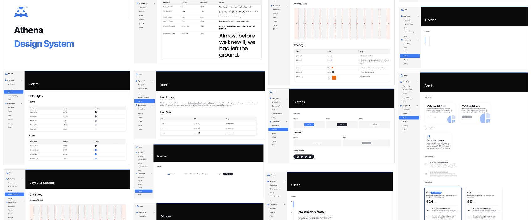
Design System
We distilled the new dashboard UI into our first Design System and style guide.
Results
30%
faster feature delivery
40%
fewer UI bugs in production
Reflections
Iterate to the right balance
Our three-phase layout tests—from raw data tables to tabbed modules to the final hybrid view—helped us optimize for both depth and scanability, driving a 27% lift in time spent on performance and allocation charts.
Invest in a living system
Formalizing Athena’s colors, typography scale, spacing tokens, and reusable cards cut front-end build time by 30% and ensured every new feature slots seamlessly into the dashboard without visual drift.
Feedback
"It finally felt like I had a command center for my accounts—not just a bunch of charts."
Athena User
"This dashboard finally gives our clients clarity without overwhelming them. It’s streamlined, but still powerful."
Financial Wellness Officer
“I used to bounce between screens to find where my IRA was hiding—now that's a thing of the past!"
Athena User
"When the allocation donut immediately showed I was 85% in equities, I rebalanced straight away—something I’d never have spotted so quickly before.”
Athena User
More Projects

The Problem
There were three problems with the legacy experience.