Mar 15, 2021
Lessons Learned Scaling an Emergency Resource App from 0 to 250,000 Users
Yes, we moved fast. But we couldn’t afford to be sloppy. If something broke—or if we got the interaction wrong—students wouldn’t come back.
What building Edquity’s first product taught me about designing for people in crisis.
In 2017, I joined Edquity as the first (and only) designer. The idea was ambitious: build a product that helps college students navigate emergency financial needs. No clear scope. No product in place. Just a hypothesis—students are dropping out because they can’t access help in time—and a lot of urgency.
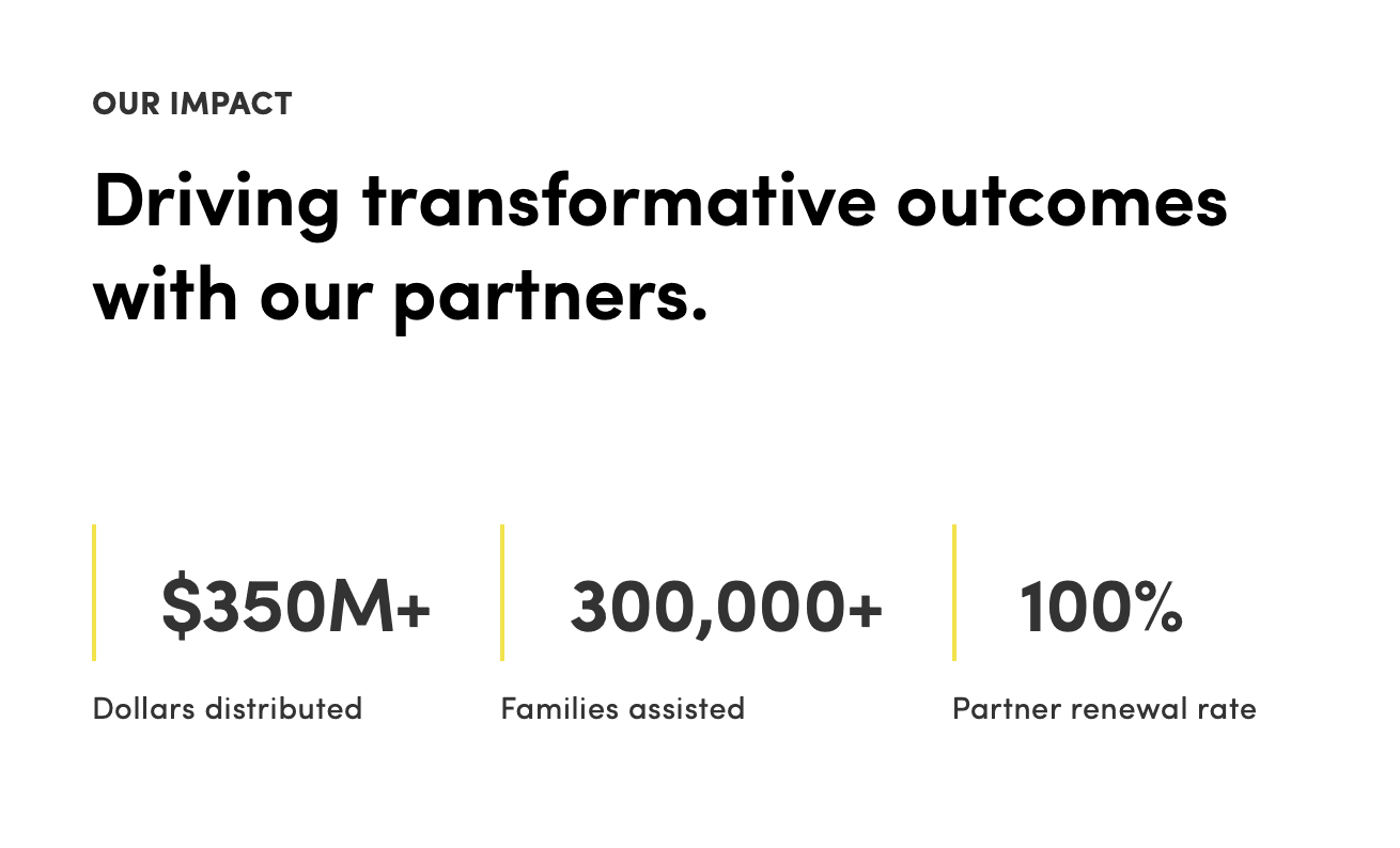
Over the next few months, I led research, prototyping, testing, and design for the MVP. Today, the product supports over 250,000 students across the country.
This post isn’t a breakdown of features. It’s about what it means to design in a high-stakes environment, when the cost of a bad experience isn’t churn—it’s someone going hungry, losing housing, or dropping out of school.
1. Precision beats polish
When someone’s in crisis, even small decisions can have real consequences. The order of information. The words on a button. Whether a phone number is tappable.
I learned quickly that clarity mattered more than elegance. My main goal at every turning point was to reduce friction. The goal was to get students what they needed with as few taps and questions as possible.
2. Context is everything
You can’t solve for urgency if you don’t understand how people actually experience it.
We spent weeks listening: to students juggling work, school, and caregiving; to administrators trying to help without the right tools; to researchers studying the hidden costs of being poor on campus. Every insight shaped how we thought about the product—not just what it should do, but how it should feel.
Empathetic, but not condescending. Direct, but not cold. More like an older sibling than a financial advisor.
3. MVP doesn’t mean fragile
Yes, we moved fast. But we couldn’t afford to be sloppy. If something broke—or if we got the interaction wrong—students wouldn’t come back.
We prioritized stability and trust over novelty. A feature that didn’t work reliably did more harm than good, even if it looked good in a prototype.
4. Sometimes your best design work doesn’t ship—and that’s okay
There were entire flows I designed that never made it into the build. Engineering constraints, shifting priorities, tight timelines. It happens.
But those explorations weren’t wasted. They clarified edge cases. Sparked better questions. In some cases, they got picked up in later iterations.
You keep moving. You keep designing. You accept the version that goes live and keep advocating for the version that should exist.
5. Invisible work is still meaningful
Students never knew who designed the app. Most didn’t even think of it as “a product.” It was just a way to get help—fast.
But that’s the point. When you design for crisis, success isn’t measured in delight or DAUs. It’s measured in moments of relief. In a student who finds a food pantry before lunch, or gets connected to childcare before missing another class.
If you want to see how we approached research, explored different concepts, and got the first version out the door,read the full case study →